The same Choice-Based Conjoint engine as traditional CBC, presented as an online shop or a store shelf. The manual of the CBC Shop editor: every step and control, the complete Shop Display step, recommended study sizes, and the design diagnostics. Worked example: the electric pizza oven of the Pizza (Example) study.
How to build a realistic shopping task in Choicery, step by step through the editor.
1. What Is CBC Shop?
CBC Shop is a Choice-Based Conjoint study presented like a real store. The respondent answers the familiar question,
which of these would you choose? Each alternative is still a bundle of attribute levels, the choice is
recorded exactly as in traditional CBC, and the utilities are estimated with Hierarchical Bayes on the same path as
CBC. What changes is the presentation: the alternatives appear as an e-commerce list, as gallery
cards, or as products standing on a shelf with a price label.
The reason is realism. A task that looks like the place where the product is really bought carries
context that a bare grid leaves out. For packaged goods, CBC with realistic store-shelf displays is "a robust
approach" (Orme, 2020, p. 48), although virtual shopping environments sometimes pay off in better data and sometimes
do not (Orme, 2020, pp. 35-36).
CBC Shop is CBC, not a separate method
Random utility theory, the multinomial logit, Hierarchical Bayes, effects-coded part-worths and importances are identical to traditional CBC. Everything you know about reading CBC results carries over. Only the presentation differs.
The pizza oven study used throughout this guide
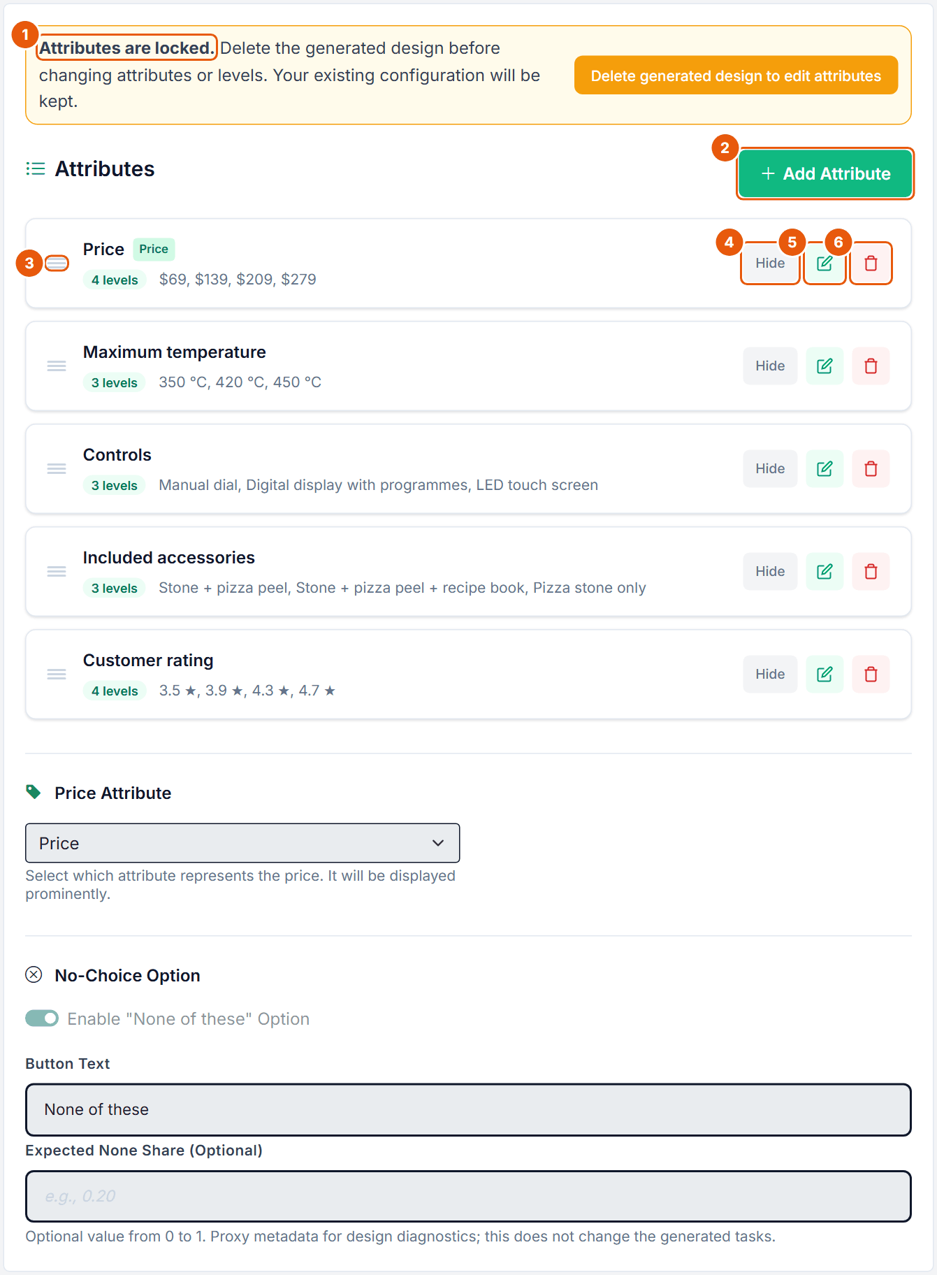
The Pizza (Example) study contains a CBC Shop task cbcs_pizza_oven about an electric pizza oven for the home. Five attributes: Price ($69, $139, $209, $279, marked as the Price Attribute), Maximum temperature (350 °C, 420 °C, 450 °C), Controls (Manual dial, Digital display with programmes, LED touch screen), Included accessories (Stone + pizza peel, Stone + pizza peel + recipe book, Pizza stone only) and Customer rating (3.5 ★, 3.9 ★, 4.3 ★, 4.7 ★). Each task shows three ovens in the Shop Horizontal layout with a product photo, and a "None of these" option.
2. When to Use It (and When Not)
Use CBC Shop when the look of the buying context plausibly changes how people choose: products browsed as online listings, goods picked from a shelf, or categories where the product photo and the price tag drive the decision. If a plain card grid already captures the decision, traditional CBC is simpler and statistically just as good.
Situation
Use
A realistic shop or shelf presentation matters for the decision
CBC Shop
Standard "pick one of several products", plain cards are fine
CBC Traditional
You also need "would you buy it at all?" after a forced choice
DR-CBC (dual response)
You want extra information per task (best and worst)
Best-Worst CBC
Many single items (features, messages), no product profiles
MaxDiff
3. Opening the Editor
1
New task. In the Survey Flow, open the Add Item sidebar (always visible on wide screens; on smaller screens use the Add Item button in the utility bar) and choose CBC Shop in the Conjoint section.
2
Existing task. On the task's card in the flow, click Edit (tooltip "Configure"). In the list view, click the row or its gear link.
The browser tab reads "CBC Shop Configuration", and the left rail carries the badge "CBC Shop". On a Free account a project can hold at most two conjoint tasks.
CBC Shop Guide: opens this guide in a new browser tab, so unsaved edits stay where they are.
Table 1. The steps of the CBC Shop editor. The sections below follow this order.
What saves automatically and what needs a click
Step
How changes are stored
General
Click Save changes in the toolbar at the top of the step.
Attributes
Adding, editing, deleting, hiding and reordering are stored at once. The Price Attribute selector saves as soon as you change it.
No-Choice Option
Its own button Save No-Choice Options.
Shop Display
Click Save changes in the toolbar at the top of the step. There is no autosave; the status shows unsaved changes until you click.
Fixed Tasks, Product Images, Prohibitions
Stored when you confirm the dialog. Fixed-task positions need Apply Positions on the Generate step.
Level Images, Templates, Generate
Stored when you pick an image, click Save or Apply, or when generation finishes.
Table 2. Saving in the CBC Shop editor.
The two locks
A design exists. The Attributes step shows "Attributes are locked. Delete the generated design before changing attributes or levels. Your existing configuration will be kept." with the button Delete generated design to edit attributes. Prohibitions are locked too. The Shop Display, the question, images and fixed-task definitions stay editable, because they do not change the design.
Responses exist. A banner at the top reads "Design locked - responses already collected" with the number of active and trashed responses. To change the design, open Data > Bin and permanently delete all responses, or duplicate the project to keep them. Preview, downloads and design diagnostics stay available.
The editor can also show "Design Warning: ..." when the stored design no longer matches the configuration, and "Regeneration required. This generated design conflicts with active prohibitions and cannot be published until it is regenerated."
4. General
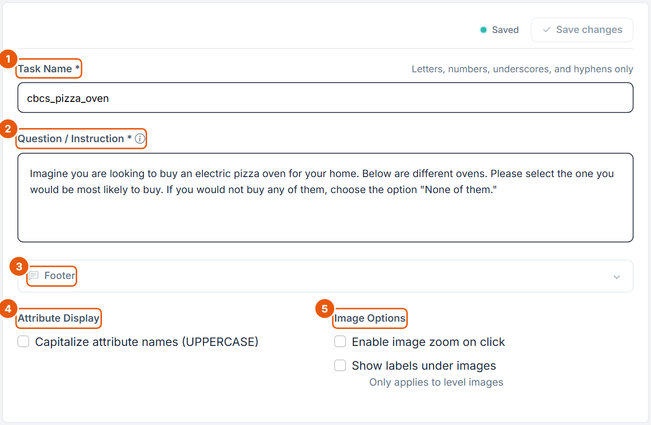
Figure 1. The General step of the CBC Shop pizza oven task.
No.
Control
What it does
1
Task Name *
Internal name and column prefix in your data (cbcs_pizza_oven). Up to 50 characters, start with a letter, then letters, numbers, underscores and hyphens.
2
Question / Instruction *
Rich text shown above every task. The default reads "If you were buying a new product and these were the only alternatives available, which one would you choose?". Up to 10,000 characters and 10 inline images.
3
Footer
Optional rich text below the task (up to 10,000 characters).
4
Attribute Display
Capitalize attribute names (UPPERCASE), off by default.
5
Image Options
Enable image zoom on click and Show labels under images (only applies to level images). Both off by default.
Unlike traditional CBC there is no Layout Style and no Option Header here: the whole look is set on the Shop Display step (section 6).
5. Attributes, Price Attribute and No-Choice Option
Attributes
Figure 2. The Attributes step of the CBC Shop pizza oven task. Price carries the "Price" badge.
No.
Control
What it does
1
Attributes are locked.
Shown while a generated design exists. The orange button deletes the design so you can edit attributes again.
2
Add Attribute
Opens the Add Attribute dialog (Figure 3).
3
Drag handle
Changes the order of the attributes.
4
Hide / Show
Hidden attributes stay in the design and are estimated, but are not displayed. Use it when the product photo already shows the attribute.
5
Edit
Edit Attribute dialog: name and levels as small rich-text editors (without images), levels reorderable, Shift+Enter for a line break, Save changes.
6
Delete
Deletes the attribute after confirmation.
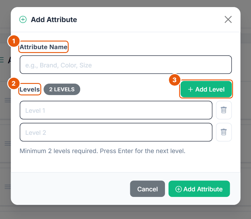
Figure 3. The Add Attribute dialog.
No.
Control
What it does
1
Attribute Name
Up to 50 characters.
2
Levels
One row per level (up to 50 characters each), with a counter badge and a bin to delete a row. In this dialog levels cannot be dragged; reorder them later in the Edit dialog. Enter jumps to the next level.
3
Add Level
Adds a level row. At least 2 levels are required.
The same server rules as in CBC apply: 2 to 20 levels per attribute, at most 20 attributes, names unique ignoring capitalization. Free plan: at most 4 attributes with at most 4 levels each (the five-attribute Pizza task needs a paid plan).
Price Attribute and No-Choice Option
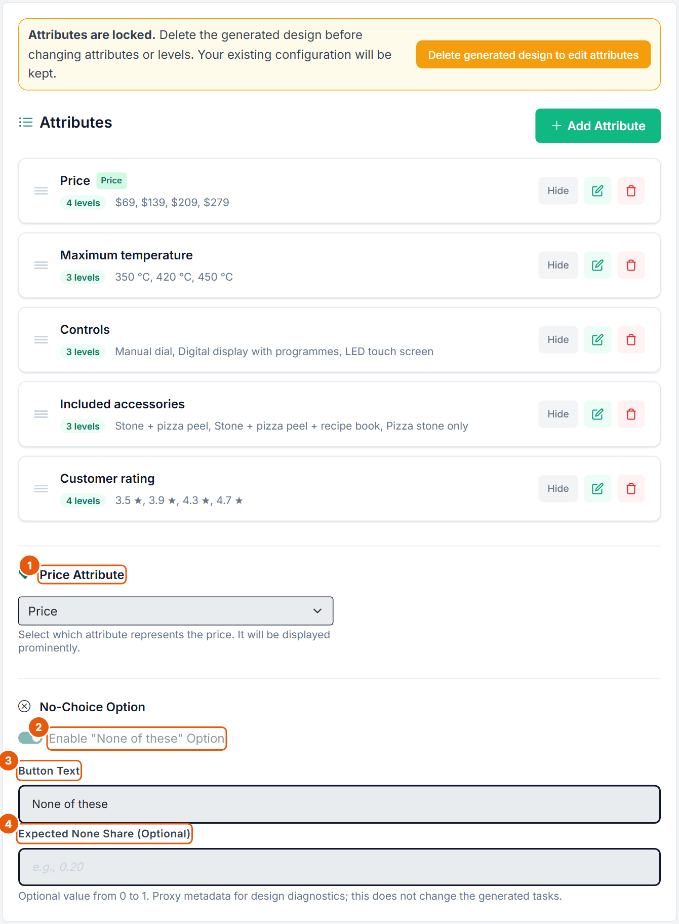
Figure 4. Price Attribute and No-Choice Option below the attribute cards.
No.
Control
What it does
1
Price Attribute
"-- No price attribute --" or one of your attributes. The chosen attribute is shown as a price (large, styled with Price Size and Price Color) instead of an ordinary attribute line, and gets the "Price" badge. The Shelf layout needs it for its price labels. Saved as soon as you change it.
2
Enable "None of these" Option
Adds a None choice to every task. Off by default for a new CBC Shop task (on in the Pizza task).
3
Button Text
The label of the None choice, "None of these" by default (up to 200 characters).
4
Expected None Share (Optional)
Optional value from 0 to 1 (for example 0.20). Metadata for the design diagnostics only; it does not change the generated tasks.
Below these fields, Save No-Choice Options stores the None settings. CBC Shop has no Position control for the None option; in the shop layouts it appears as a wide button below the products (Figure 19).
None in a shop
A real shopper can leave without buying, so a None option usually makes a shop task more realistic (Orme & Chrzan, 2017, ch. 5; Rao, 2026, pp. 494-495). Expect about 5 to 20 % None choices (Orme, 2020, p. 111). Showing more alternatives lowers the None share (Orme & Chrzan, 2017, ch. 5), so simulations with a different number of products than the survey need care.
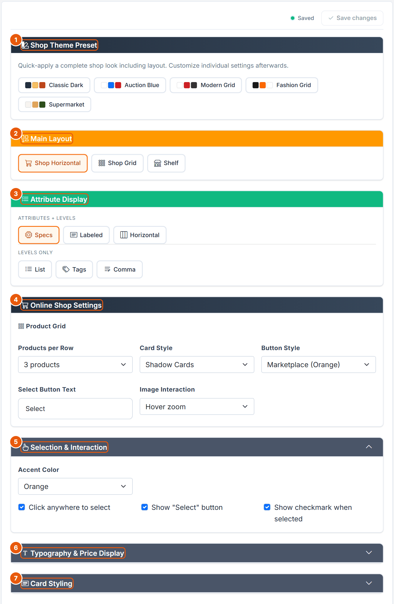
6. Shop Display
The Shop Display step holds the whole presentation. It changes what respondents see, never the design or the data the model receives. Save it with Save changes at the top right.
Figure 5. The Shop Display step of the Pizza task (Shop Horizontal layout).
No.
Card
What it does
1
Shop Theme Preset
Five one-click looks (section 6.1).
2
Main Layout
Shop Horizontal, Shop Grid or Shelf (section 6.2).
3
Attribute Display
How the levels read inside a product card (section 6.4). Hidden on Shelf.
4
Online Shop Settings
Products per row, card and button style, button text, image behaviour (section 6.5). Shop layouts only.
5
Selection & Interaction
Accent colour and how a product is selected (section 6.6).
6
Typography & Price Display
Collapsed by default: text and price styling (section 6.7).
7
Card Styling
Collapsed by default: corners, spacing and background of the cards (section 6.8). Hidden on Shelf.
On Shelf, a Shelf Settings card (section 6.3) appears directly below Main Layout, and the cards that only make sense for online shops disappear. Table 3 shows what is visible in which layout.
Card or control
Shop Horizontal
Shop Grid
Shelf
Shelf Settings
no
no
yes
Attribute Display
yes (with Horizontal)
yes
no
Online Shop Settings
yes
yes
no
Selection & Interaction
all controls
all controls
Accent Color and checkmark only
Font Size, Font Weight, Text Color
yes
yes
no
Price Size, Price Color
yes
yes
yes
Price Tag Style, Price Tag Background
no
no
yes
Card Styling
yes
yes
no
Table 3. Which Shop Display controls appear for which layout.
6.1 Shop Theme Preset
"Quick-apply a complete shop look including layout. Customize individual settings afterwards." A preset sets the layout and a group of styling options at once. It never changes the typography (font size, weight, text colour), Image Interaction, the checkmark or the click-anywhere setting.
Preset
Layout
What it sets
Classic Dark
Shop Horizontal
Specs, 3 per row, Bordered Cards, orange button, text "Add to Cart", accent Orange, price red and Large, border None, radius Small, spacing Normal, background Light gray.
Auction Blue
Shop Horizontal
Specs, Bordered Cards, Primary (Blue) button, text "Buy It Now", accent Blue, price red and Extra Large, border Solid, radius Medium, background White.
Modern Grid
Shop Grid
Labeled, 3 per row, Shadow Cards, Danger (Red) button, text "Select", accent Red, price black and Large, border None, radius Medium, spacing Relaxed, background White.
Fashion Grid
Shop Grid
List, 2 per row, Minimal cards, Outline button, text "Select", accent Orange, price black and Extra Large, border None, radius None, spacing Relaxed, background White.
Supermarket
Shelf
Only switches to Shelf. Switching to Shelf then sets the price colour to black and ticks up to four label attributes. It does not change the Shelf Look.
Table 4. The five Shop Theme Presets.
6.2 Main Layout
Layout
What it looks like
Best for
Shop Horizontal (default)
An e-commerce list: one product per line, image on the left, attributes and price in the middle, the select button on the right.
Products standing on a shelf with a price label under each one.
Packaged goods, in-store decisions.
Table 5. The three main layouts.
There is no separate sub-layout control. Pick the layout that matches the channel in which your product is really bought.
6.3 Shelf Settings
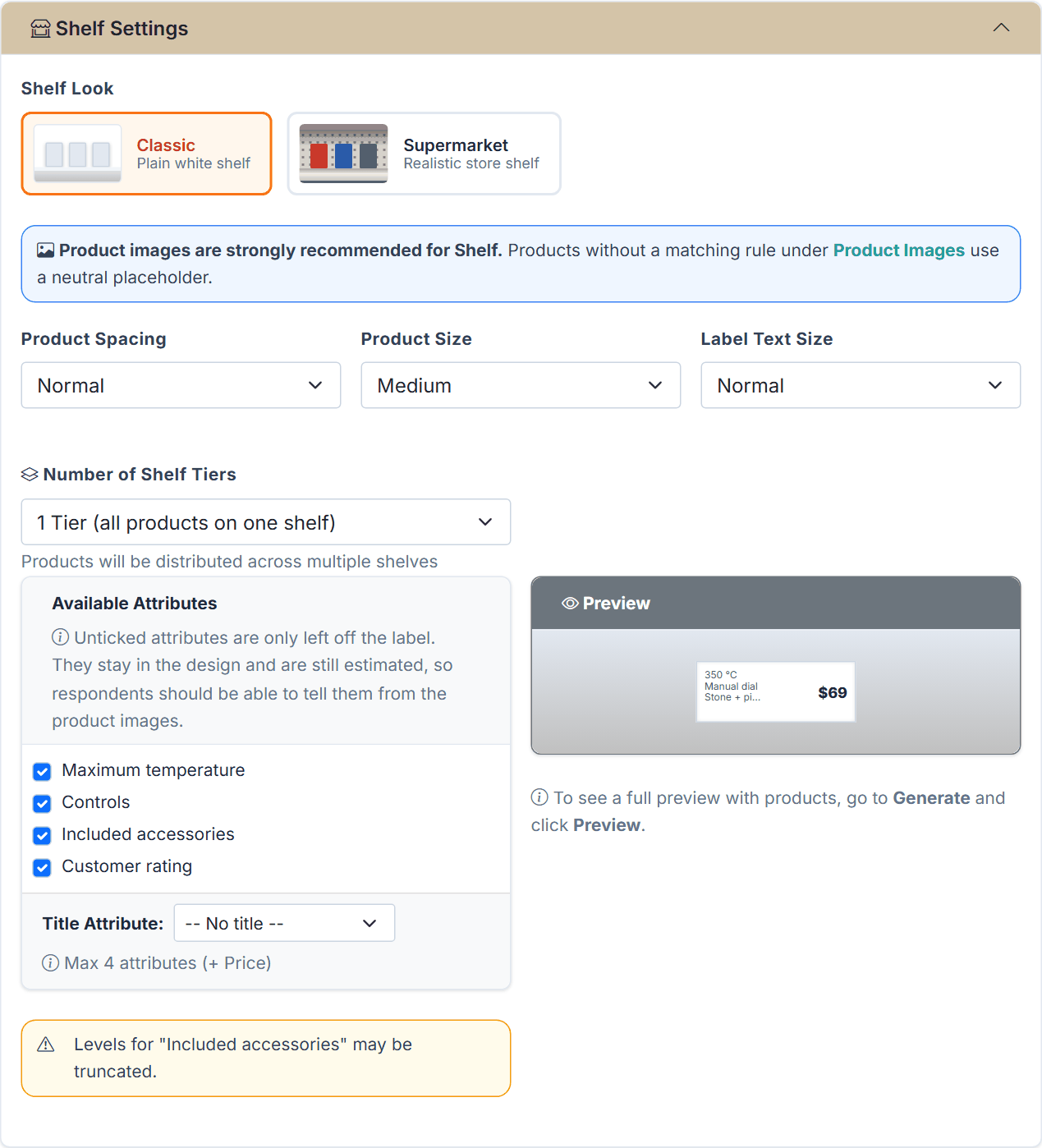
Figure 6. The Shelf Settings card for the Pizza ovens after choosing the Shelf layout: Shelf Look Classic, four attributes ticked for the label and the warning that the levels of "Included accessories" may be truncated.
Two notes appear in the card. The blue note recommends product images, because a shelf shows products, not cards: products without a matching rule under Product Images get a neutral placeholder. The yellow warning names every ticked attribute whose first level is longer than 14 characters ("Stone + pizza peel" in the example); the label shortens such text with "...", as the label preview shows. Shorter level names or fewer ticked attributes avoid it.
Control
Options
Default and notes
Shelf Look
Classic (Plain white shelf), Supermarket (Realistic store shelf)
Classic.
Product Spacing
Tight, Normal, Wide
Normal.
Product Size
Small, Medium, Large
Medium. Size of the product photos.
Label Text Size
Small, Normal, Large
Normal. Text on the price label.
Number of Shelf Tiers
1 Tier (all products on one shelf), 2, 3 or 4 Tiers
1. "Products will be distributed across multiple shelves."
Available Attributes
One checkbox per attribute, except the price and hidden attributes
Up to 4 are ticked when you switch to Shelf. Ticked attributes print on the price label; at most 4 ("Maximum 4 attributes allowed on price label."). Unticked attributes stay in the design and are still estimated, so respondents should be able to tell them from the product images.
Title Attribute
"-- No title --" or one ticked attribute
No title. Prints that attribute as the bold first line of the label. Footer: "Max 4 attributes (+ Price)".
Table 6. The Shelf Settings.
Messages on this card:
"Product images are strongly recommended for Shelf. Products without a matching rule under Product Images use a neutral placeholder." Shelf does not use level images.
"No price attribute defined!" when no Price Attribute is set. The shelf needs it for its labels; set it in the Price Attribute section of the Attributes step.
"X is not shown on the price label. If the product image shows it, hide the attribute." for unticked attributes.
"Levels for "X" may be truncated." when the first level of a ticked attribute (other than the title) is longer than 14 characters.
The Preview panel next to the list redraws one price label as you tick attributes. For the full shelf with products, generate a design and open the Preview step.
6.4 Attribute Display
Decides how the levels read inside a product card (Shop Horizontal and Shop Grid; hidden on Shelf).
Group
Option
Look
Attributes + Levels
Specs (default)
Level in bold, attribute name beside it in grey, as in Figure 19 ("450 °C Maximum temperature").
Labeled
"Name: Value" pairs.
Horizontal
Attributes as columns. Only offered for Shop Horizontal.
Levels only
List
One level per line, no attribute names.
Tags
Levels as badges.
Comma
All levels in one comma-separated line.
Table 7. Attribute Display options.
Levels-only formats look most like a real listing, but only work when the levels explain themselves. "3.9 ★" does; "420 °C" is clearer with its attribute name.
6.5 Online Shop Settings
Shown for Shop Horizontal and Shop Grid, under the heading Product Grid.
Control
Options
Default and notes
Products per Row
2, 3, 4, Auto (responsive)
3. Only affects Shop Grid; Shop Horizontal always shows one product per line.
Card Style
Shadow Cards, Bordered Cards, Minimal
Shadow Cards. Sets the border of the product cards in both shop layouts. Minimal shows only a line below each card, with square corners.
Hidden is accepted only together with "Click anywhere to select" (section 6.6).
Select Button Text
free text, up to 30 characters
"Select". For example "Add to Cart" or "Buy Now".
Image Interaction
Hover zoom, Click to enlarge, No effect
Hover zoom.
Table 8. Online Shop Settings.
Realism, not mimicry
Aim for a storefront that feels real, not a copy of a specific retailer. Keep the page generic and the product names neutral; a recognisable brand look can prime respondents.
6.6 Selection & Interaction
Control
Default
What it does
Accent Color: Orange, Blue, Green, Purple, Red
Orange
Colour of the outline of the selected product.
Click anywhere to select
on
A click anywhere on the card selects it, not only on the button. Hidden on Shelf, where shelf slots are always clickable.
Show "Select" button
on
Shows the button on each product. Hidden on Shelf.
Show checkmark when selected
on
Adds a check mark to the chosen product (in Figure 19 the button then reads "Select ✓").
Table 9. Selection & Interaction.
Every product must stay selectable. If you switch off click-anywhere and hide the button at the same time, saving fails with "Each product must remain selectable. Enable click-anywhere selection or show a visible Select button." Keeping both on is the safest combination on phones.
6.7 Typography & Price Display
Control
Options
Default and where shown
Font Size
Small (12px), Medium Small (14px), Medium (16px), Large (18px), Extra Large (20px)
Medium. Shop layouts only.
Font Weight
Normal, Medium, Bold
Normal. Shop layouts only.
Text Color
Dark (#333), Gray, Light, Black
Dark. "Color for attribute names and level values". Shop layouts only.
Price Size
Normal (16px), Large (24px), Extra Large (32px), XXL (40px)
Large. All layouts.
Price Color
Red (classic), Green, Orange, Blue, Black, White (for dark bg)
Red. All layouts.
Price Tag Style
Simple text, Badge/pill, Store tag (yellow bg), Round sticker
Simple text. Shelf only.
Price Tag Background
None, Yellow, White, Red, Green
None. Shelf only.
Table 10. Typography & Price Display. There is no price position control in the current layouts.
Price is usually the strongest driver of choice, so present it as it is presented in the real channel: a discounter shows large, coloured prices, a premium store smaller ones.
6.8 Card Styling
Control
Options
Default and notes
Border Style
Solid, None, Shadow only, Dashed
Solid. Only affects the classic card layout, not Shop Horizontal or Shop Grid; for those, the card border comes from Card Style in Online Shop Settings.
Border Radius
None (sharp), Small (4px), Medium (8px), Large (16px), Round (24px)
Medium (8px). Corner rounding of the product cards (Minimal cards stay square).
Card Spacing
Compact (12px), Normal (20px), Relaxed (30px)
Normal. Space between the product cards.
Card Background
White, Light gray, Transparent
White. Background of the product cards.
Table 11. Card Styling (hidden on Shelf). The survey uses the same pixel values as the labels and the editor preview.
7. Fixed Tasks
A fixed task shows the same products to every respondent. Choicery leaves fixed tasks out of estimation and uses them as holdouts for hit rates.
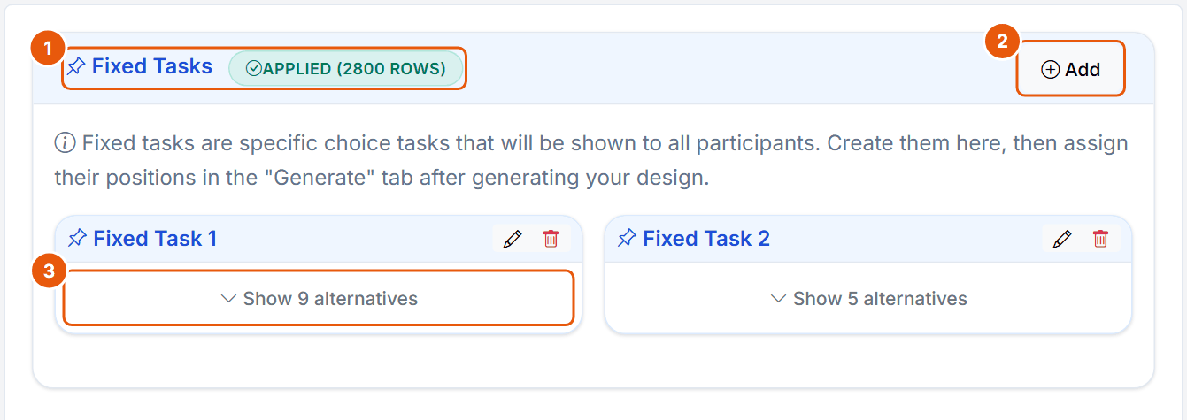
Figure 7. The Fixed Tasks step of the Pizza CBC Shop task: two fixed tasks with 9 and 5 alternatives.
No.
Control
What it does
1
Fixed Tasks + badge
"Applied (N rows)" once the fixed tasks are placed in the design (2800 rows here), "Draft (not applied)" before.
2
Add
Opens Create Fixed Task (Figure 8). At most 20 fixed tasks.
3
Show N alternatives
Expands the card. Pencil edits, bin deletes.
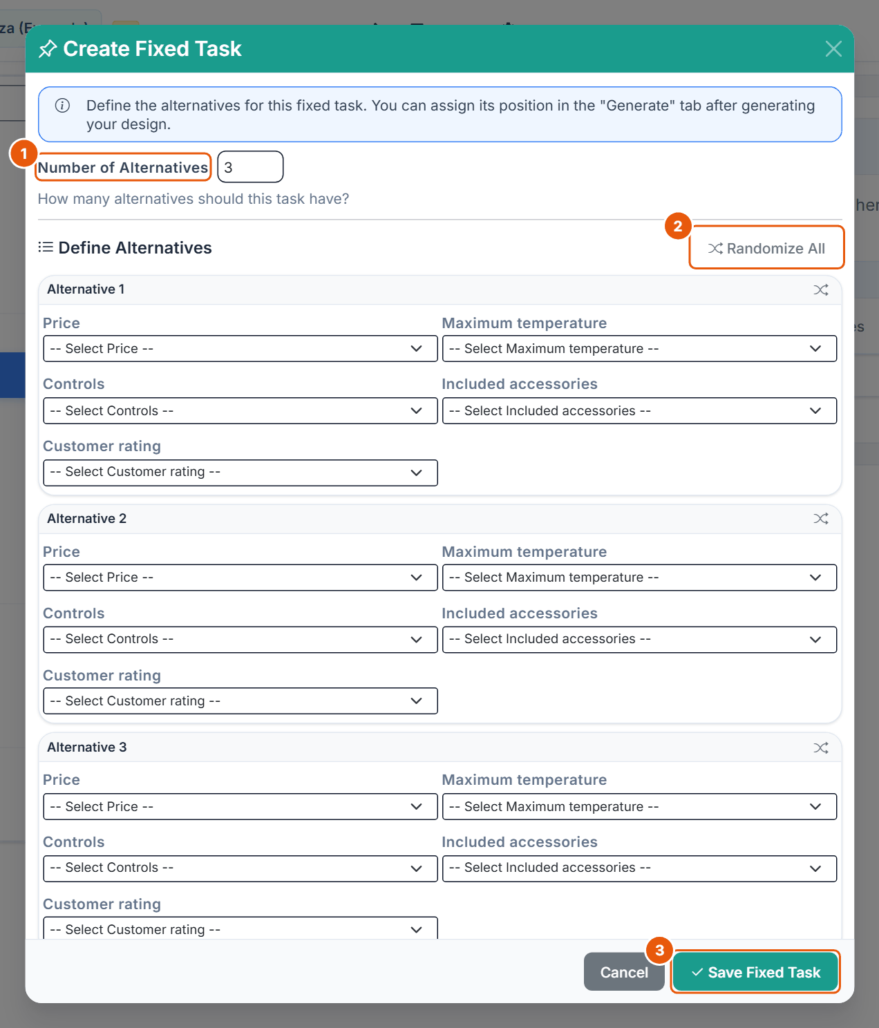
Figure 8. The Create Fixed Task dialog.
No.
Control
What it does
1
Number of Alternatives
2 to 9, default 3. A fixed task may show more products than the random tasks, for example a full shelf of 9.
2
Randomize All
Fills every selector with a random level; the shuffle icon of an alternative fills only that one.
3
Save Fixed Task
Enabled once every attribute of every alternative has a level.
Without fixed tasks the step warns that hit rates cannot be calculated. Positions are set on the Generate step (section 12). Holdouts with many alternatives are "more realistic than using smaller choice sets" (Rao, 2026, p. 261), and one holdout is not enough (Orme, 2020, pp. 191-192; see section 15).
8. Product Images
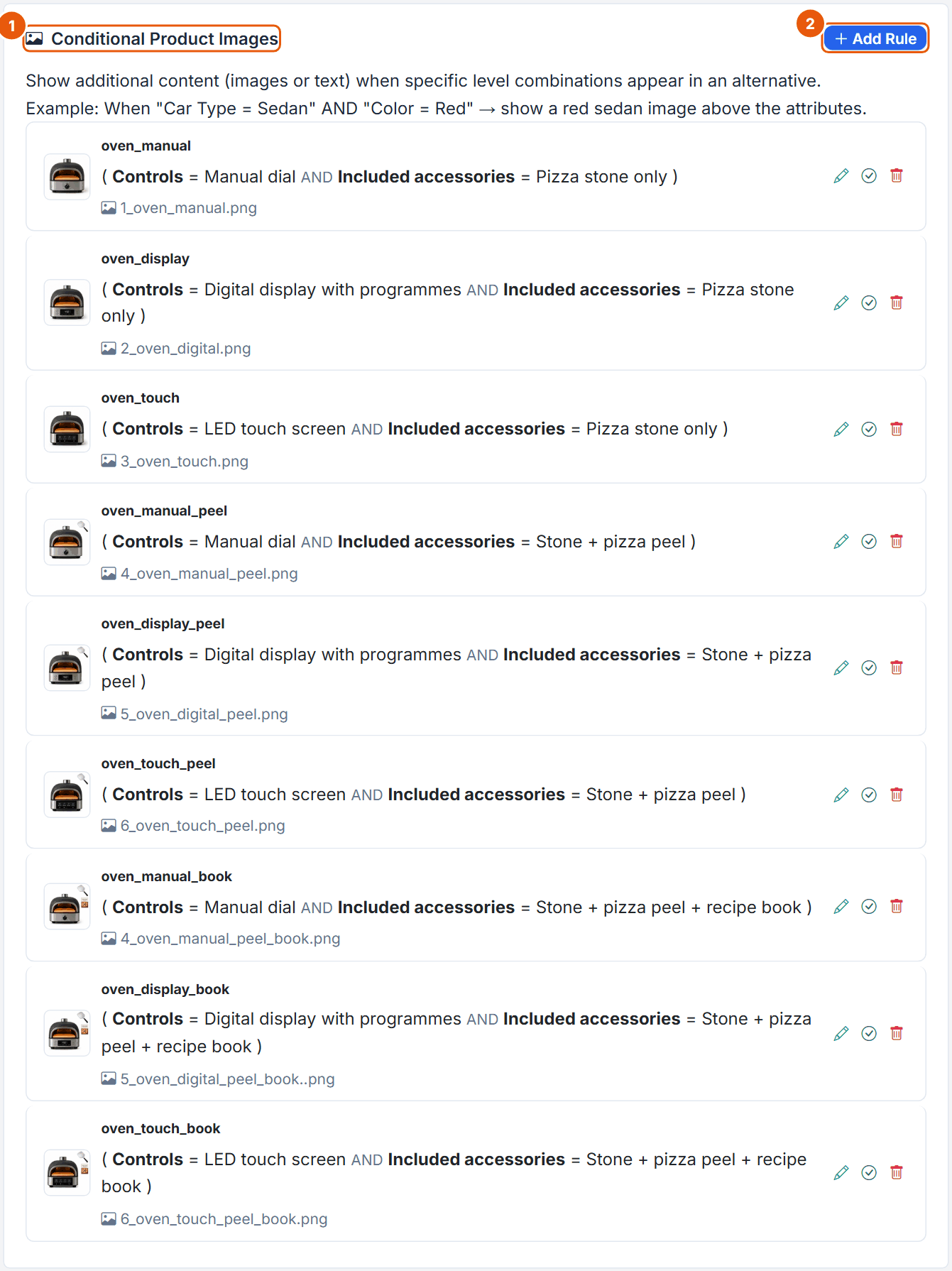
Product images give each product its photo, which the shop and shelf layouts are built around. A rule shows an image when a concept contains a given combination of levels.
Figure 9. The nine product image rules of the Pizza ovens.
No.
Control
What it does
1
Conditional Product Images
The list of rules: name, conditions, image file, and icons to edit, switch on or off, and delete.
2
Add Rule
Opens the Add Product Image dialog (Figure 10). At most 30 rules.
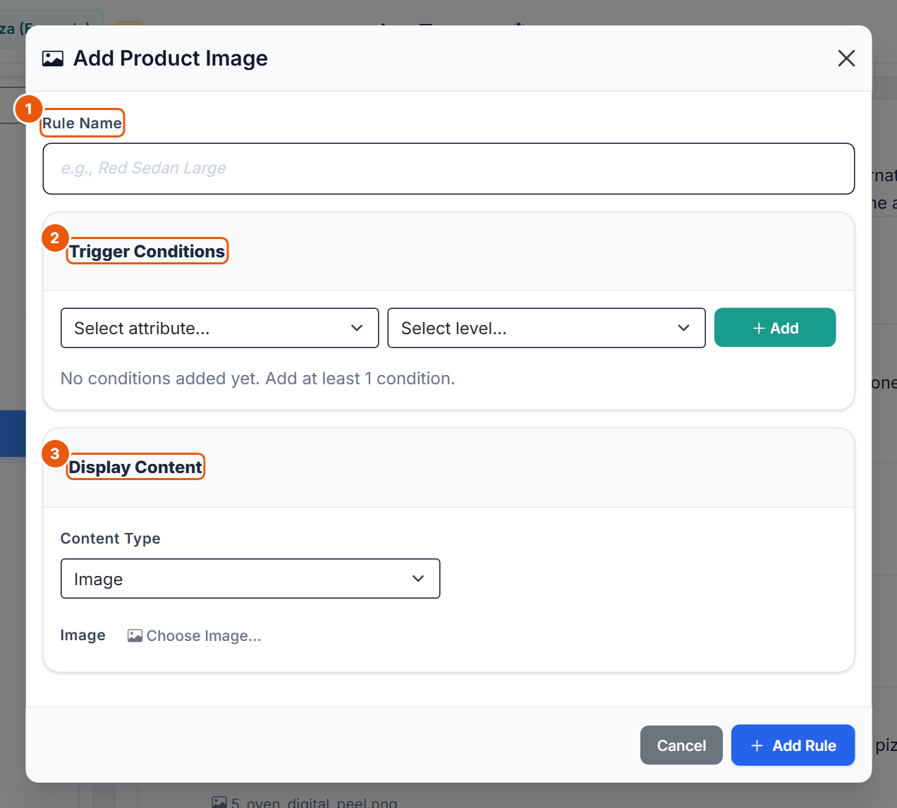
Figure 10. The Add Product Image dialog.
No.
Control
What it does
1
Rule Name
Up to 80 characters.
2
Trigger Conditions
Attribute and level, then Add; at least one condition. Conditions form groups with an AND/OR switch; New condition group adds a group, groups are combined with AND; Preview shows the expression.
3
Display Content
Content Type Image (Choose Image... from the library) or Text (up to 1,000 characters). For CBC Shop use Image: the product photo is what the shop and shelf layouts show.
Pizza example
Nine rules cover the 3 x 3 combinations of Controls and Included accessories. The rule oven_manual (Controls = Manual dial AND Included accessories = Pizza stone only) shows 1_oven_manual.png. The photos therefore show the controls and the accessories; temperature, rating and price are read from the card text.
9. Level Images
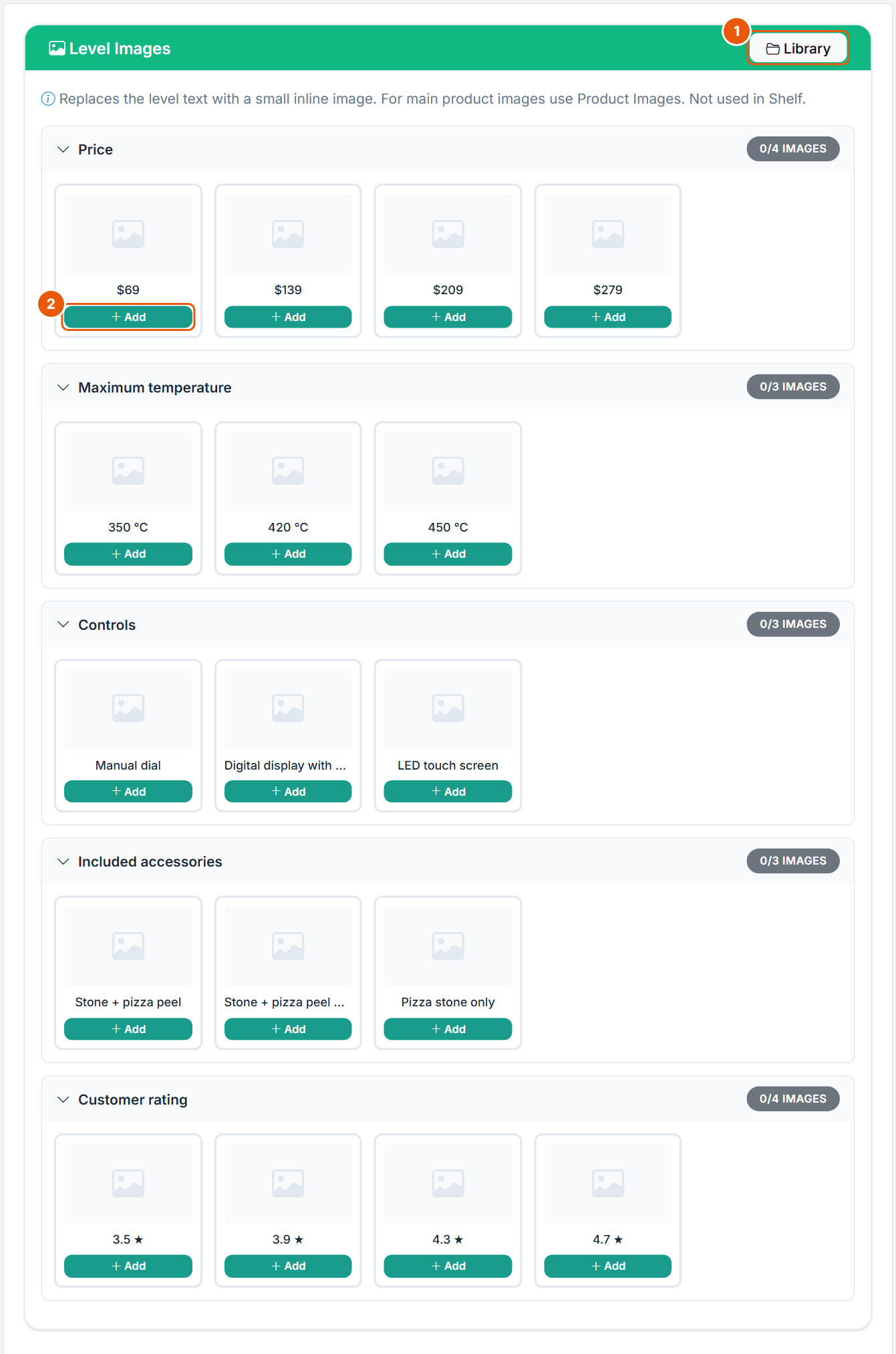
Figure 11. The Level Images step. The Pizza task uses no level images.
No.
Control
What it does
1
Library
Opens the project image library.
2
Add
Assigns an image to this level; it can later be changed or removed.
"Replaces the level text with a small inline image. For main product images use Product Images. Not used in Shelf." Image files may be PNG, JPG, JPEG, GIF or WebP, up to 5 MB and 4100 x 4100 px each (GIF up to 2 MB and 1024 px); up to 100 images and 200 MB per project.
10. Prohibitions
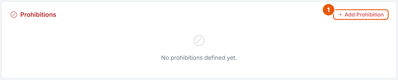
Figure 12. The Prohibitions step. The Pizza task has no prohibitions.
No.
Control
What it does
1
Add Prohibition
Opens the dialog in Figure 13. Disabled without attributes and while a generated design exists.
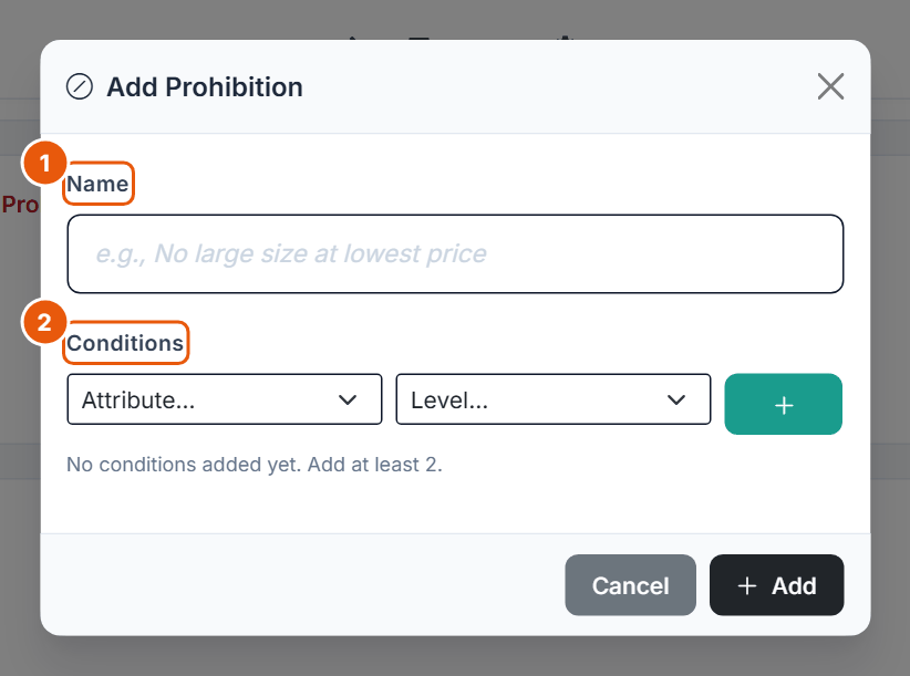
Figure 13. The Add Prohibition dialog.
No.
Control
What it does
1
Name
Required, for example "No touch screen at $69".
2
Conditions
Attribute and level, then +. At least 2 conditions, each attribute only once per prohibition. Confirm with Add.
Prohibitions can be switched off, edited or deleted; at most 50 per task. After a change the editor reports fixed tasks removed from their positions or a design that must be regenerated. Use prohibitions "sparingly or not at all" (Orme, 2020, pp. 53-54): they almost always lower efficiency (Orme & Chrzan, 2017, ch. 3). A realistic shelf makes implausible products stand out, but a combined attribute is often the better fix than a prohibition.
11. Templates
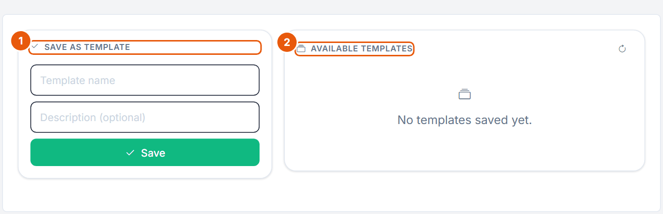
Figure 14. The Templates step.
No.
Control
What it does
1
Save as Template
Template name (required), Description (optional), Save.
2
Available Templates
Your templates with Apply, rename and delete, a count and a storage summary.
A template stores attributes and levels, hidden attributes, level images, prohibitions, product image rules, the General settings, the Shop Display settings, the No-Choice settings and the fixed tasks. Templates work across CBC, DR-CBC, BW-CBC and CBC Shop. The confirmation names only attributes, images, prohibitions and product images, but applying replaces all stored parts. Applying is refused while a generated design exists.
12. Generate
Before generation
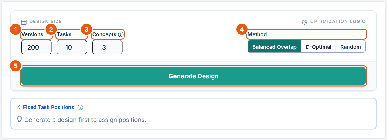
Figure 15. The Generate step before a design exists, with the default values.
No.
Control
What it does
1
Versions
Different questionnaires; one per respondent, reused when there are more respondents. 1 to 1,000, default 200.
2
Tasks
Number of random tasks per respondent; fixed tasks come on top (10 + 2 = 12 screens in the Pizza task). 1 to 30, default 10. Free plan: at most 6 including active fixed tasks.
3
Concepts
Products per task, without None. 2 to 9, default 3. Free plan: at most 3.
4
Method
Balanced Overlap (default, recommended): level and pair balancing with moderate overlap. D-Optimal: coordinate-exchange search for a low D-error under zero priors; slower. Random: no optimization.
5
Generate Design
Starts generation with a progress panel and Cancel; at most 300 seconds.
There is no seed field: every generation draws a new random seed. The editor warns when Concepts exceed the levels of an attribute (repeated levels are then unavoidable). The shop layout plays no part in the design.
After generation
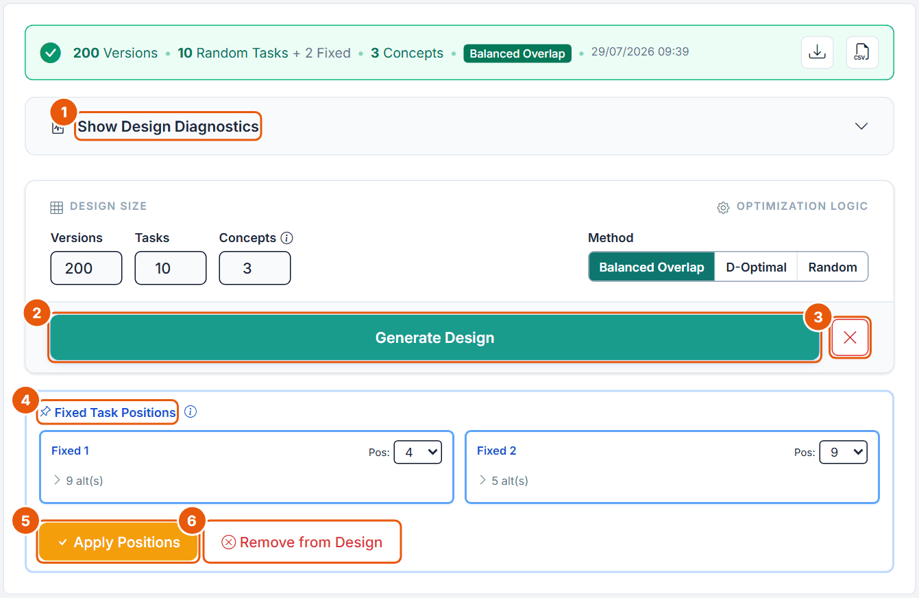
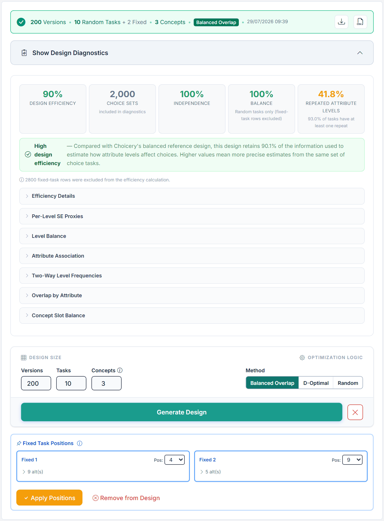
Figure 16. The Pizza CBC Shop design: 200 versions, 10 random tasks plus 2 fixed, 3 concepts, Balanced Overlap. Fixed 1 sits at position 4, Fixed 2 at position 9.
No.
Control
What it does
1
Show Design Diagnostics
Opens the diagnostics (section 13).
2
Generate Design
Generates again after the confirmation "Replace existing design?". Blocked once responses exist.
3
Delete design
Deletes the design and unlocks attributes and prohibitions. Disabled once responses exist.
4
Fixed Task Positions
A Pos: selector per fixed task, from 1 to the total number of tasks; each position once.
5
Apply Positions
Inserts the fixed tasks at those positions.
6
Remove from Design
Takes the fixed tasks out of the design; their definitions stay.
The status bar shows versions, random and fixed tasks, concepts, method and date, with buttons for the design report and the design CSV.
13. Design Diagnostics
Figure 17. The Design Diagnostics of the Pizza CBC Shop task: 90 % design efficiency, 2,000 choice sets, 100 % independence and balance, 41.8 % repeated attribute levels.
Element
What it shows
What to do
Design Efficiency
Precision compared with Choicery's balanced reference design. Status band: Excellent (at least 98 %), Very high (95 to below 98 %), High (90 to below 95 %), Good (80 to below 90 %), "Low design efficiency - review recommended" (below 80 %), or "Not estimable".
Below 80 %: check prohibitions, tasks, versions and method.
Choice Sets
Random tasks across all versions (200 x 10 = 2,000).
Information only.
Independence
How independently the attributes vary.
Low values usually come from prohibitions.
Balance
How evenly the levels appear (random tasks only).
Low values point to prohibitions or very few versions.
Repeated Attribute Levels
Share of attribute comparisons where two or more products show the same level, and the share of tasks with at least one repeat.
Some repeats are intended with Balanced Overlap and unavoidable when Concepts exceed an attribute's levels.
Table 12. The tiles of the Design Diagnostics.
Below the tiles: the number of prohibitions applied, the note that fixed-task rows were excluded from the efficiency calculation, and the sections Efficiency Details (D-efficiency, A-Efficiency Ratio, parameters, No-Choice ASC, Expected None Share), Per-Level SE Proxies (target about 0.05 or less for main effects, Orme & Chrzan, 2017, ch. 3), Level Balance, Attribute Association, Two-Way Level Frequencies, Overlap by Attribute and Concept Slot Balance (whether levels are spread evenly over the product positions).
14. Preview and the Respondent View
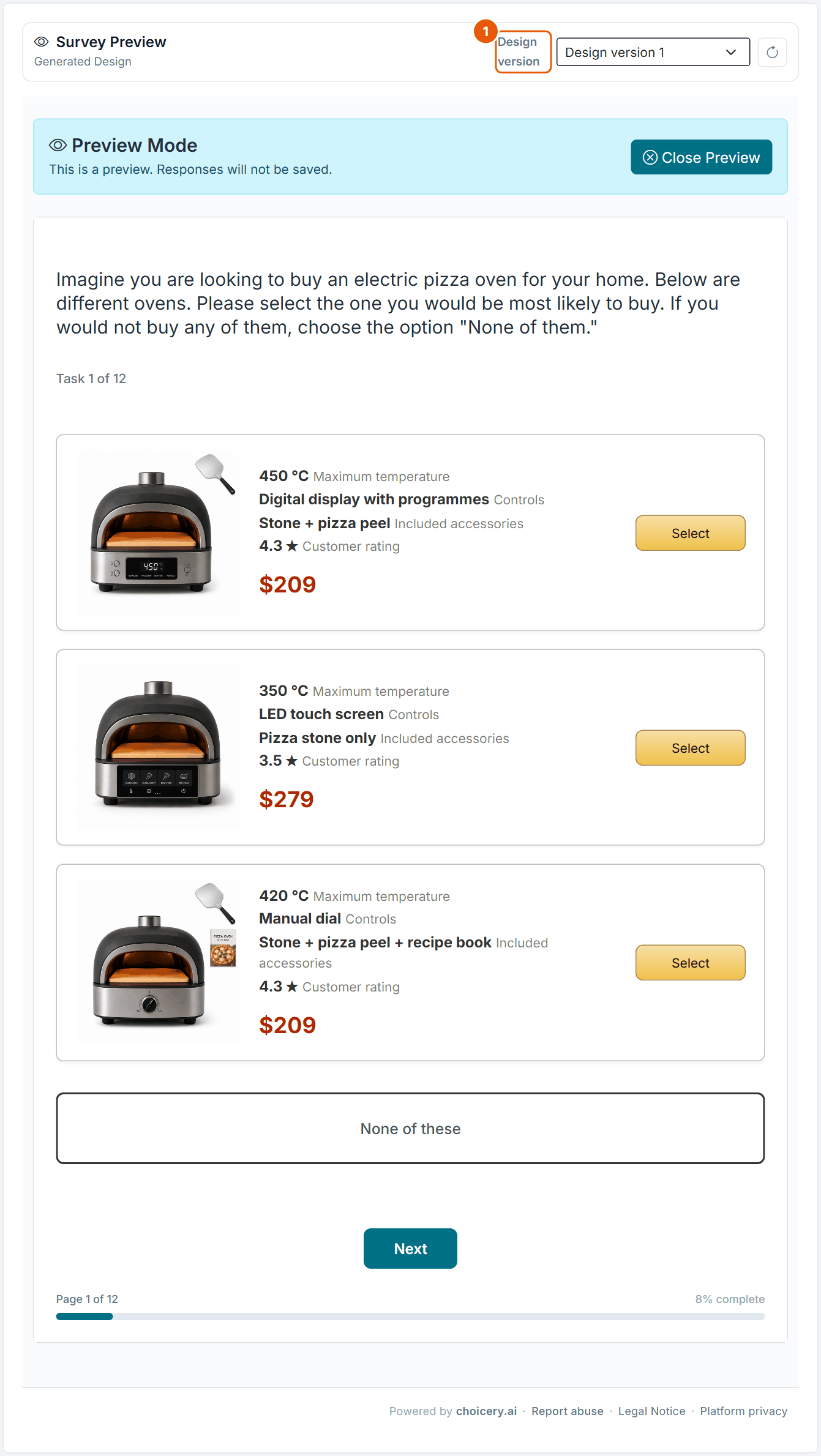
Figure 18. The Preview step: the real participant page in preview mode, task 1 of 12 of design version 1.
No.
Control
What it does
1
Design version
Picks the version; the button next to it reloads. The preview below is the real participant page ("Preview Mode. Responses will not be saved."), so you click through it with Next.
Before a design exists the step shows an example preview. Check the preview on a phone as well: Shop Grid and Shelf get crowded on small screens.
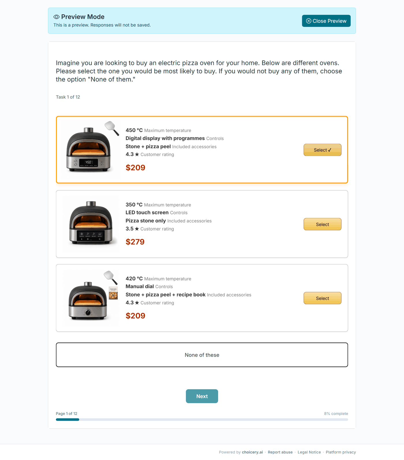
Figure 19. Task 1 of 12 of the Pizza CBC Shop as the respondent sees it (survey preview): three ovens with photo, attribute lines and price, a Select button each, None of these below. The first oven is selected: accent outline and a check mark on its button.
The recorded data is identical to traditional CBC: the shown levels, the chosen product and the products it beat. The order in which the products were displayed is stored as well, which allows the optional display-position control in estimation (section 16).
15. How Large Should Your Study Be?
The editor accepts up to 20 attributes with 20 levels each, 30 tasks and 9 concepts. The literature recommends far less. CBC Shop is standard CBC, so the CBC recommendations apply.
Setting
Recommendation
Choicery limit
Sources
Attributes
About 6 to 8 at most.
20 (Free plan 4)
Orme (2020, pp. 49-50)
Levels per attribute
2 to 5, about 5 at most for price, balanced across attributes. Brand may keep more levels if the real shelf has more brands.
2 to 20 (Free plan 4)
Orme (2020, pp. 52-53); Rao (2026, pp. 74-75)
Tasks per respondent
8 to 12; more than about 15 no longer helps HB.
1 to 30, default 10 (Free plan 6 incl. fixed)
Orme (2020, p. 109); Goeken et al. (2024, p. 150)
Concepts per task
3 to 5 for standard tasks. Shelf studies of packaged goods may show many more products; no source in our library gives a maximum for a shelf screen.
2 to 9, default 3 (Free plan 3)
Orme (2020, pp. 47-48, 62); Rao (2026, pp. 234, 362)
Sample size (rule)
n x t x a / c ≥ 500, better 1,000.
none
Orme (2020, p. 64); Orme & Chrzan (2017, ch. 8)
Sample size (minimum)
At least 300, or 200 per reported subgroup; plan to discard 10 to 30 %.
Include when feasible; about 5 to 20 % None; more products lower the None share.
on/off (off by default)
Orme (2020, p. 111); Orme & Chrzan (2017, ch. 5)
Holdout (fixed) tasks
More than one; 7 in-sample holdouts in a simulation for medium effects.
up to 20
Orme (2020, pp. 191-192); Orme & Chrzan (2017, ch. 6)
Versions
About 10 to 12 good versions capture most of the value.
1 to 1,000, default 200
Orme & Chrzan (2017, ch. 3)
Table 13. Recommended values and the Choicery limits.
Pizza example: the sample-size rule
t = 10 random tasks, a = 3 products, c = 4 (Price and Customer rating have 4 levels): n ≥ 500 x 4 / (10 x 3) = 67, or 134 for the stricter 1,000. The minimum of 300 respondents (200 per reported subgroup) is the binding value.
Where the sources disagree
Maximum number of attributes. 6 to 8 (Orme, 2020, p. 50); four or fewer for CBC in the chapter by Orme in Rao (2026, p. 527); concern only at 15 or more (Orme & Chrzan, 2017, ch. 7).
Number of tasks. 8 to 12 in practitioner sources (Orme, 2020, p. 109); in standard CBC predictive validity can peak well before the last task (Sablotny-Wackershauser et al., 2024, Web Appendix H, pp. 139-140).
Sample-size threshold. 500 as the minimum with 1,000 recommended (Orme, 2020, p. 64) versus 1,000 (Orme & Chrzan, 2017, ch. 8).
Holdouts. "Usually 2 or so" in older ratings-based practice (Rao, 2026, p. 122) versus many more in the simulation of Orme and Chrzan (2017, ch. 6).
Shop-specific evidence
Show products as buyers see them in the market; mixing graphic and text attributes can bias choices toward the graphic ones (Orme, 2020, p. 50). In the Pizza task the photos carry Controls and Included accessories, the text carries the rest.
Screen position matters: without randomized order the first of three concepts was chosen 39.6 % of the time and the third 24.5 % (Mao, Kessels & Mee, 2025, p. 2). This was tested with three concepts, not on shelves. The Estimate Display Position Effects option (section 16) and Concept Slot Balance address it.
When respondents do not know market prices, they learn them during the tasks and the None share grows; giving typical prices before the tasks removed this effect (Hung, Kurz, Bailey, Huber & Allenby, 2025, pp. 11-12).
16. Estimating & Interpreting Results
Estimation is standard CBC. Open Conjoint Analysis, select the CBC Shop task and use Preference Estimation (HB).
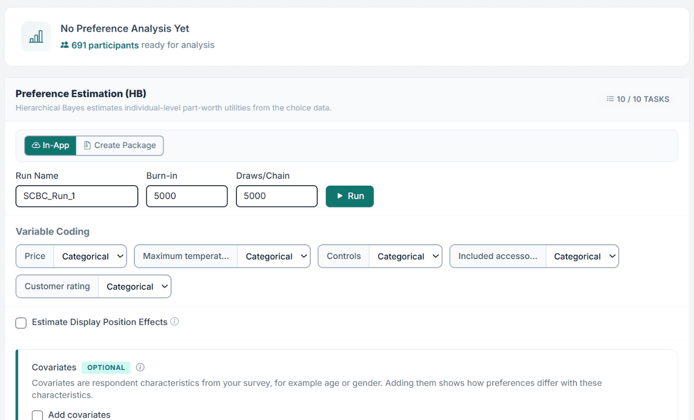
Figure 20. The Estimation step for the Pizza CBC Shop task before the first run (691 participants ready, 10 of 10 tasks): Run Name SCBC_Run_1, the defaults 5,000 / 5,000, Variable Coding and the unticked Estimate Display Position Effects.
One control exists only for CBC Shop: Estimate Display Position Effects adds control terms for the displayed product order (Display Position 1, 2, ...), which separates position effects from attribute utilities. Everything else (Run Name, Burn-in, Draws/Chain, Variable Coding with linear price, covariates, In-App and Create Package) works as described in the Preference Analysis (HB) guide. Reading the results (convergence, importances, utilities) is described in the CBC Traditional guide, section 16.
Match the layout to the real channel: Shelf for in-store, Shop Horizontal or Shop Grid for online.
Set the Price Attribute first; Shelf cannot label its products without it.
Add Product Images rules for every combination that defines the photo before you tune the look.
Keep 6 to 8 attributes at most, 8 to 12 random tasks, and plan at least 300 respondents.
Add more than one fixed task as holdout.
Preview on desktop and on a phone, and pilot the survey before fielding.
Do not
Do not let styling hide the attributes. If respondents cannot read the levels, the choice is noise.
Do not hide both the Select button and click-anywhere selection (the editor refuses to save it).
Do not add prohibitions liberally.
Do not copy a recognisable retailer or brand.
Do not expect CBC Shop numbers to differ in kind from CBC; they are the same utilities from a more realistic task.
Part II
Theoretical Background
Why realistic presentation matters, and why the estimation is identical to traditional CBC.
18. Key Definitions
Choice-Based Conjoint (CBC)
A method that shows respondents sets of product profiles and records which one they choose, then recovers part-worth utilities from those choices. CBC Shop is CBC with a customised presentation.
Ecological validity
The degree to which a study's task and stimuli resemble the real environment to which the results are meant to generalise. A shelf or storefront presentation raises the ecological validity of a choice task.
Presentation (stimulus)
Everything the respondent sees and interacts with: layout, images, price styling, buttons. In CBC Shop the presentation is customised; the underlying profiles and data are not.
Part-worth utility
The contribution of a level to the attractiveness of a profile. Estimated per respondent, identically to CBC.
Hypothetical bias
The gap between choices stated in a survey and choices made when something real is at stake. More realistic tasks are one way to narrow it.
Incentive alignment
Putting a real consequence on the choice (a chance to actually receive the chosen product) so respondents answer truthfully. A related but separate lever from presentation realism, and not something CBC Shop adds on its own.
19. Ecological Validity & Realistic Presentation
The idea that a study's stimuli should resemble the natural environment of the behaviour under study goes back to Egon Brunswik, who argued for representative design and coined the notion of ecological validity (Brunswik, 1956). Applied to choice experiments: preferences are measured through a task, and the more that task resembles the real decision, the more the measured preferences resemble real ones.
Stated-choice methodologists make the same point. Louviere, Hensher, and Swait (2000) stress that the realism of the choice context shapes how well stated choices transfer to the market, and Lancsar and Swait (2014) frame the external validity of discrete choice experiments around whether survey choices predict real ones. A central threat to that transfer is hypothetical bias: choices made with nothing at stake can drift from choices made in a real store. Presentation realism is one lever against it.
A second, stronger lever is incentive alignment: giving respondents a real chance to receive what they choose, which improves out-of-sample prediction (Ding, Grewal, & Liechty, 2005; Ding, 2007). In meta-analyses of the authors' own studies, incentive alignment and adaptive designs both improved prediction (Sablotny-Wackershauser et al., 2024, Web Appendix H, pp. 118-120). CBC Shop works on presentation only; it does not put anything at stake by itself. Where an incentive-aligned study is impractical, a realistic presentation closes part of the same gap.
Realism is a means, not a guarantee
More styling is not automatically better. An over-decorated task can distract from the attributes and add noise, and a presentation that mimics the wrong channel imports the wrong context. No presentation fixes a poor experimental design: identification of the part-worths depends on level balance and orthogonality, which live in the design, not in the styling.
20. The Shared CBC Engine
CBC Shop rests on the same random utility theory as every CBC-family method (McFadden, 1974). Respondent h assigns to profile j a utility equal to the sum of its levels' part-worths plus a random error, and chooses the profile with the highest total utility. If the errors are independent extreme-value, the choice probability takes the multinomial logit form:
P(choice = j | βh) = exp(Xj′ βh) / Σk exp(Xk′ βh)
The same multinomial logit likelihood as traditional CBC. The presentation does not enter this equation; only the optional display-position terms add the shown order as control variables.
Individual part-worths are estimated with Hierarchical Bayes, drawing each respondent's βh from a population normal and borrowing strength across respondents (Lenk, DeSarbo, Green, & Young, 1996; Train, 2009). Effects coding, the zero-centered-diff rescaling and attribute importances are computed exactly as in CBC. Choicery has no separate estimator for the "Shop" label; the shop layout sits on top of the standard CBC/HB path.
For the full derivation (random utility model, Gibbs sampler, effects coding, zero-centered diffs, importances, experimental design), see Part II of the CBC Traditional guide.
21. References
Brunswik, E. (1956). Perception and the representative design of psychological experiments. Berkeley, CA: University of California Press.
Ding, M. (2007). An incentive-aligned mechanism for conjoint analysis. Journal of Marketing Research, 44(2), 214-223.
Ding, M., Grewal, R., & Liechty, J. (2005). Incentive-aligned conjoint analysis. Journal of Marketing Research, 42(1), 67-82.
Goeken, N., Kurz, P., & Steiner, W. J. (2024). Multimodal preference heterogeneity in choice-based conjoint analysis: A simulation study. Journal of Business Economics, 94, 137-185.
Hung, C.-Y., Kurz, P., Bailey, R. A., Huber, J., & Allenby, G. M. (2025). Re-examining the no-choice option in conjoint analysis. Journal of Choice Modelling, 57, 100578.
Lancsar, E., & Swait, J. (2014). Reconceptualising the external validity of discrete choice experiments. PharmacoEconomics, 32(10), 951-965.
Lenk, P. J., DeSarbo, W. S., Green, P. E., & Young, M. R. (1996). Hierarchical Bayes conjoint analysis: Recovery of partworth heterogeneity from reduced experimental designs. Marketing Science, 15(2), 173-191.
Louviere, J. J., Hensher, D. A., & Swait, J. D. (2000). Stated choice methods: Analysis and applications. Cambridge: Cambridge University Press.
Mao, Y., Kessels, R., & Mee, R. (2025). Beyond randomization: Design and analysis of discrete choice experiments in the presence of profile order effects within choice sets. Applied Stochastic Models in Business and Industry, 41, e70043.
McFadden, D. (1974). Conditional logit analysis of qualitative choice behavior. In P. Zarembka (Ed.), Frontiers in econometrics (pp. 105-142). New York: Academic Press.
Orme, B. K. (2020). Getting started with conjoint analysis: Strategies for product design and pricing research (4th ed.). Manhattan Beach, CA: Research Publishers.
Orme, B. K., & Chrzan, K. (2017). Becoming an expert in conjoint analysis: Choice modeling for pros. Provo, UT: Sawtooth Software.
Rao, V. R. (2026). Applied conjoint analysis: From product and service design to market and pricing strategies (2nd ed.). Cham: Springer. (Chapter 16 is written by B. Orme.)
Sablotny-Wackershauser, V., Lichters, M., Guhl, D., Bengart, P., & Vogt, B. (2024). Crossing incentive alignment and adaptive designs in choice-based conjoint: A fruitful endeavor. Web Appendices.
Train, K. E. (2009). Discrete choice methods with simulation (2nd ed.). Cambridge: Cambridge University Press.