Complete guide to every question type and every button in its editor, from a simple text page to Market Research pricing, quotas and display logic. Worked example: the Pizza (Example) study.
Understanding the editor, adding items, and structuring your survey.
The Survey Flow Editor (top navigation Survey) is the central workspace where you build and organize your survey. It shows every item in the order participants will encounter it, grouped into pages. Each item, whether a question, a text page or a choice task, appears as a card that you can reorder, edit, deactivate or delete.
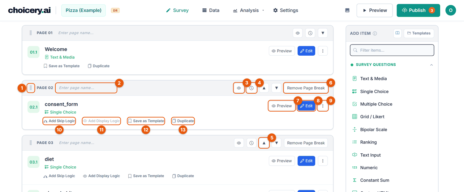
Every screenshot in this guide is taken from the real app with the Pizza (Example) study, a short pizza-delivery survey that uses one of every question type. Wherever you see variable names like diet, Pizza_toppings, food_involvement, favorite_topping, last_order_amount, or KANO_Pizza, they refer to real items from this study. It ships with your account, so you can open it and follow along. The orange numbers in the screenshots belong to the button tables next to them.
| No. | Button | What it does |
|---|---|---|
| 1 | Drag handle | Drag the whole page (with all its items) to another position. |
| 2 | Page name | Free text, up to 20 characters, for your own orientation. Participants never see it. The badge in front (PAGE 01, PAGE 02 ...) numbers the pages. |
| 3 | Preview Page | Shows the whole page as participants see it, in a new tab. Not shown on empty pages. |
| 4 | Page Timer | Sets a minimum time before participants may continue (see section 3). The icon is filled while a timer is on, and a timer badge appears in the header. |
| 5 | ▲ / ▼ | Move the page one position up or down. |
| 6 | Remove Page Break | Merges this page into the page above it (asks for confirmation when the page has items). An empty first page shows the same button as "Remove this empty page". |
| No. | Button | What it does |
|---|---|---|
| 7 | Preview | Shows this single item as participants see it, in a new tab, without saving anything. |
| 8 | Edit | Opens the item editor. On a choice task (CBC, MaxDiff ...) the button reads Configure and opens that task's own configuration screen. |
| 9 | More actions | Holds Deactivate / Activate and Delete. Deactivate keeps the item in the flow but hides it from participants after the next publish (an Inactive badge appears; collected answers are kept). Delete asks for confirmation and offers a 5-second Undo. An item that already has responses cannot be deleted; the dialog offers "Deactivate instead". On the End Page the menu holds only Delete. |
| 10 | Add Skip Logic | Opens the skip-logic dialog for this question (section 20). Reads Skip Logic Active once a rule exists. |
| 11 | Add Display Logic | Opens the display-logic dialog. Reads Display Logic Active once a rule exists. Greyed out on the first question of the survey, because a condition needs an earlier question as its source (in Figure 1 this is the consent question). |
| 12 | Save as Template | Saves the item to your template library (it belongs to your account, so you can reuse it in other projects). The dialog asks for a Template Name, a Category and an optional Description. |
| 13 | Duplicate | Places a copy directly below the original, with _copy added to its name. Skip and display logic are not copied (you get a warning). A copied choice task needs a new design. |
The two logic links appear only on data-collecting questions. Text & Media, choice tasks and the End Page get Save as Template and Duplicate only. Choice-task cards also have a Show/Hide Tasks chevron. When Between-Subject Conditions are defined, the card footer additionally shows condition pills (All, A, B ...) that restrict the item to certain conditions; a click saves at once. Ctrl+click (Cmd+click on a Mac) on a card or on an entry in the Add Item panel opens it in a new tab. At the end of the flow, Add Page inserts an empty page.
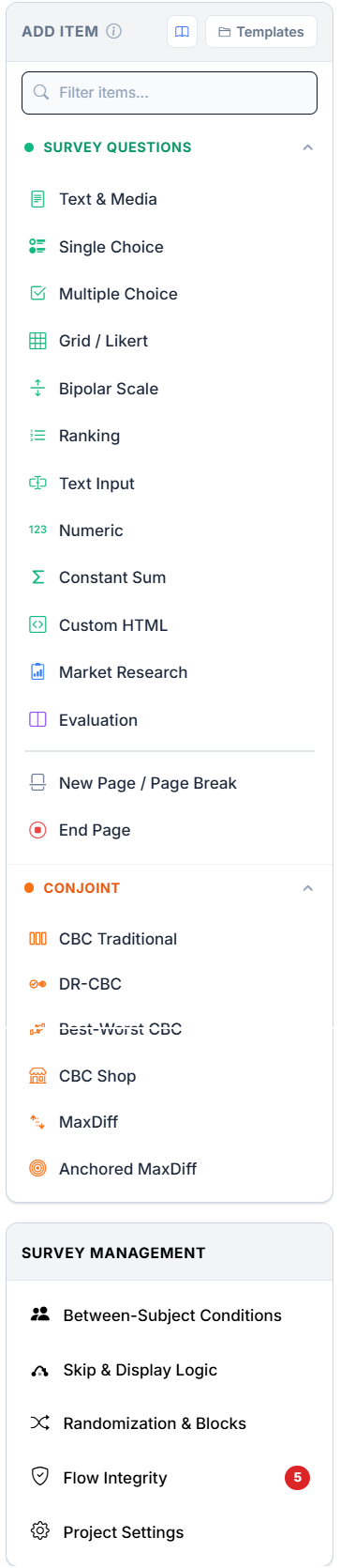
select_1c678aed for the Pizza diet item) used internally to store response data. It never changes, even when you rename the variable.diet, food_involvement, favorite_topping). It becomes the column header in data exports and can be renamed at any time without affecting stored data.The Add Item panel sits on the right of the editor. On screens narrower than about 990 pixels it is hidden; open it with the Add & Manage button . It has two collapsible sections, Survey Questions and Conjoint. The search box (Filter items...) filters the list as you type and also knows method names, so typing "Kano", "PSM" or "Regex" finds the right type. The panel header links to this guide and to Templates , your saved items.
There are two ways to add an item.
Press and hold an item type in the panel, then drag it into the flow. Drop it exactly where you want it: between two items, or onto a page boundary to start a new page. Choicery creates the item at that position with default settings and opens its editor. Constant Sum, Market Research and End Page open their add form first; a choice task opens as a draft and only enters the flow once you save it.
Click an item type to open its add form. On Save, the new item is placed just before the End Page: on the last page if that page is still empty (for example the empty first page of a new study), otherwise on a fresh page. You can then drag it wherever you like. Evaluation opens its own full-page editor, and the conjoint types open their configuration screen. New Page / Page Break opens no editor at all; it inserts the page break immediately.
Use drag when you already know where the item belongs, for example inserting a follow-up right after a specific question. Use click when you are still building out the survey and want the item appended at the end.
Below the Add Item panel, the Survey Management panel links to the survey-wide tools: Between-Subject Conditions, Skip & Display Logic, Randomization & Blocks, Flow Integrity, and Project Settings. Skip & Display Logic is a read-only overview of the rules you already have (a flow map of the jumps with Save full PNG, plus a plain-language list of the show/hide rules); the rules themselves are created on the item cards. Flow Integrity opens a dialog that lists everything needing review before publishing.
All standard item editors share the same frame: Question Name * at the top, the type-specific fields in the middle, a collapsible Footer for small print shown below the question, and at the bottom Cancel, Preview (shows the unsaved state) and Save . Large text fields (Question / Instruction) have a full formatting toolbar: Bold, Italic, Underline, Strikethrough, Text Color, Highlight, Font Size, alignment, bullet and numbered lists, Insert Link, Insert Image and Clear Formatting.
Lists of answer options, statements or items all work the same way. Each entry is one row with these controls:
| Control | Looks like | What it does |
|---|---|---|
| Number badge | blue 1, 2, 3 | The position of the entry. For choice questions this number is what gets stored. |
| Formatting | T | Opens a small toolbar for this one entry: bold, italic, colours, font size, alignment, link and Insert Image. This is the only way to put an image into an answer option. |
| Add specify text input | Single and Multiple Choice only. Turns the option into an "Other, please specify" option with a follow-up field (details in section 5). | |
| Remove | Deletes the entry. Greyed out when the list is at its minimum. Removing a filled entry shows a 6-second Undo. | |
| Import from TXT | above the list | Replaces the whole list with the lines of a text file (one entry per line), including any specify fields. |
| Add Option / Add Row / Add Item | below the list | Adds an empty entry at the end. Pressing Enter in the last entry does the same. |
Rows in the editor have no drag handle. To change the order, edit the texts in place or import the list again from a TXT file. If you want participants to see a varying order, use the Randomize setting of the question instead.
A survey is divided into pages. Each page is one screen. Items between two page breaks (or between the start or end of the survey and a page break) form one page.
The Pizza study is ordered so the engaging, attention-hungry parts come first and the background questions come last:
Welcome & consent. A Text & Media page introduces the study, followed by a Single Choice consent question (consent_form).
Warm-up attitudes. Diet, pizza habits, toppings, and the food-involvement grid ease respondents in.
Core tasks. Ranking, constant sum, Market Research pricing, and the conjoint choice tasks. Place these while respondents are freshest.
Demographics. Age, gender, marital status, and children go near the end, which reduces priming effects.
End Page. A thank-you message. If the flow has no End Page item, participants see a plain auto-generated completion screen and the flow check warns you; add an End Page item for your own wording.
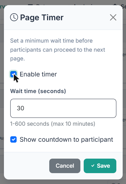
The clock button in a page header opens Page Timer, which sets a minimum wait time before participants may continue: tick Enable timer, set Wait time (seconds) between 1 and 600 (default 30), and decide whether to Show countdown to participant (ticked by default). For choice blocks, the wait applies to every task screen, including the follow-up screens in two-block mode and the Anchored MaxDiff calibration screen.
Choicery records time spent on each page. In the export, total_page_time shows cumulative time, and per-page columns (page_time_N) sit at the far right. Use these to spot speeders and disengaged respondents.
A reference for every question type, in the same order as the Add Item panel. For each type you see the participant view and the editor with its buttons.
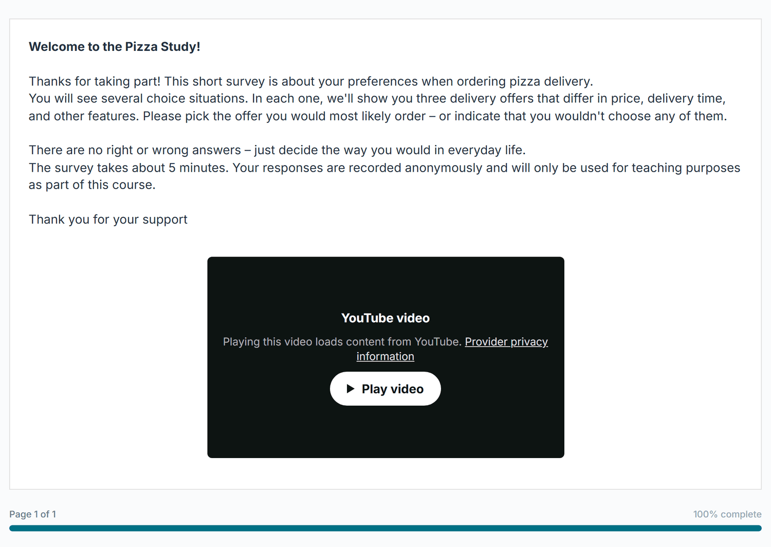
The Text & Media item displays content without collecting a response. Use it for introductions, instructions, or consent text. It holds rich text (images go inside the text via Insert Image) and optional media: an uploaded video or audio file, or a YouTube/Vimeo embed. The Pizza study opens with a Text & Media page that welcomes respondents and embeds a short YouTube video.
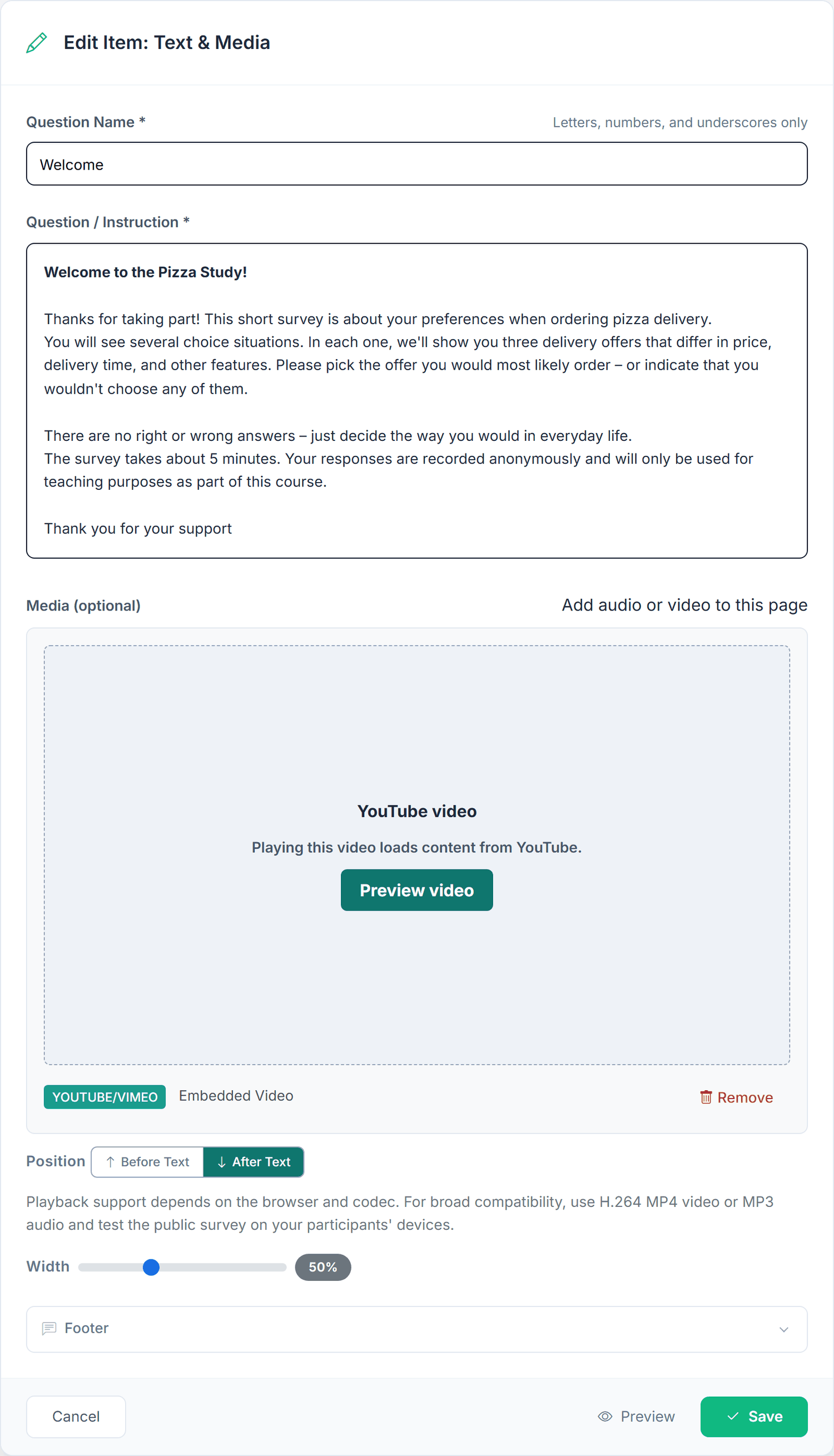
| Field / button | What it does |
|---|---|
| Question / Instruction * | The text of the page (required, up to 50,000 characters, at most 10 images). |
| Add Media | Opens Insert Media with three tabs: Video Upload (MP4, WebM, MOV, up to 50 MB), Audio Upload (MP3, WAV, OGG, M4A, up to 25 MB) and Video Embed (YouTube incl. Shorts, or Vimeo, with a Preview button). Confirm with Insert Media. |
| Remove | On the media card: removes the media again. |
| Position | Before Text or After Text (default). |
| Playback Settings | Uploaded videos only: Autoplay, Loop, Muted, Show Controls (on). Browsers only autoplay muted videos; the editor reminds you. |
| Width | Slider from 25 to 100 percent (default 100). |
A project can hold up to 100 media files and 500 MB of media in total.
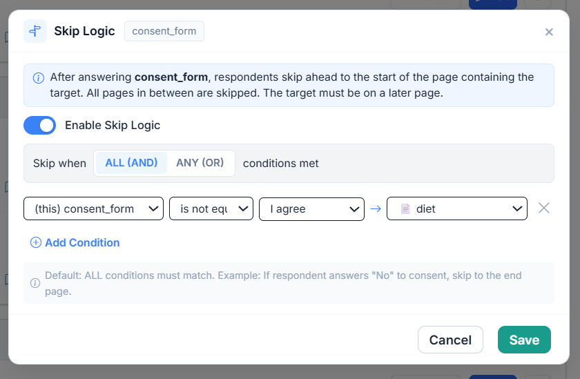
For a consent page, use a Text & Media item for the consent text, then a Single Choice item with "I agree" / "I do not agree" (as the Pizza consent_form item does). To end the survey for people who decline, add an End Page with the outcome Screened out and let skip logic jump there (section 18).
Storage: none. This item is display-only.
Single Choice presents a list of mutually exclusive options; the participant picks exactly one. It renders
as radio buttons by default, or as a dropdown for long lists. The Pizza study uses radio buttons for
diet, pizza_habits, gender and children, and a dropdown for
pizza_order (How often do you order pizza?).
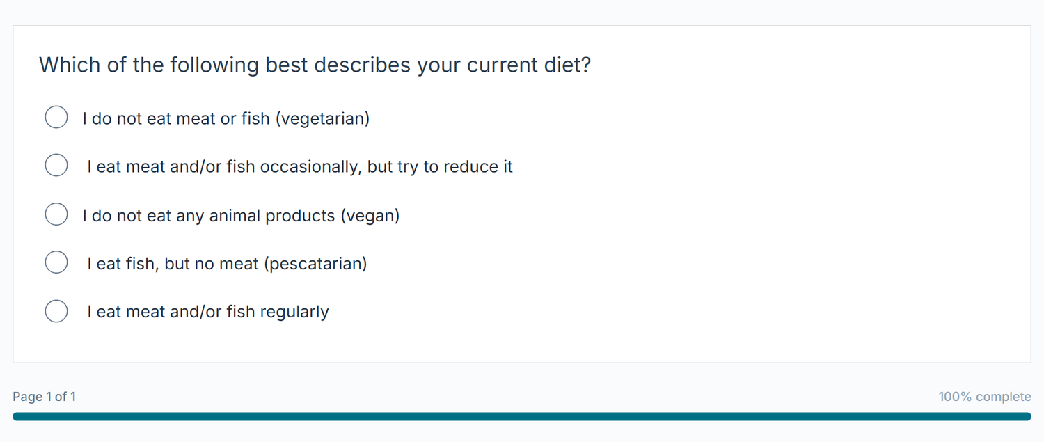
diet, Randomize options on).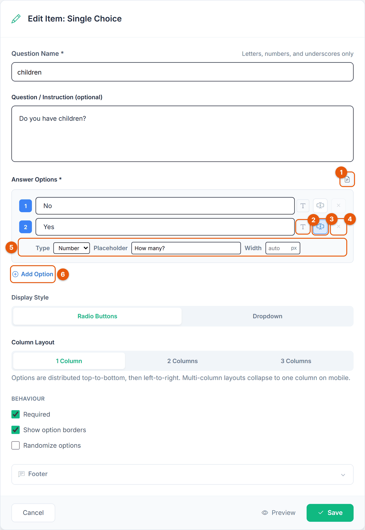
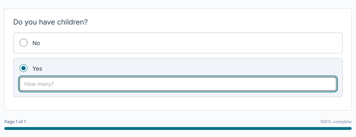
children). Option 2 "Yes" carries a specify field.| No. | Button | What it does |
|---|---|---|
| 1 | Import from TXT | Replaces all options with the lines of a text file. |
| 2 | T Formatting | Formats this option or inserts an image into it. |
| 3 | Add specify text input | This is the "Other, please specify" button. Click it on the option that needs a follow-up field. The button turns blue and the settings row 5 appears below the option. Click it again to remove the field. |
| 4 | Remove option | Deletes the option (greyed out here because a Single Choice needs at least 2 options). |
| 5 | Specify settings | Type: Text or Number. Placeholder: grey hint inside the field (default "Please specify", up to 200 characters). Width: 40 to 1000 px, empty means auto. |
| 6 | Add Option | Adds an empty option at the end. |
| Option | Description | Default |
|---|---|---|
| Question / Instruction (optional) | The question shown to participants. Supports rich text. | Empty |
| Answer Options * | The answer choices, 2 to 100. In the edit form, lists with more than 10 options can be folded ("Show N more options"). | 3 empty |
| Display Style | Radio Buttons or Dropdown. Dropdown does not render images in options; the editor warns you if you combine them. Specify fields work in both styles. | Radio Buttons |
| Column Layout | 1, 2 or 3 columns (radio buttons only; options run top to bottom, then left to right, and collapse to one column on mobile). | 1 Column |
| Required | Whether an answer is needed before continuing. | On |
| Show option borders | Draw a border around each option row. | Off |
| Randomize options | Shuffle the option order per participant to reduce order bias. | Off |
Stored under the bare {item_id}. The saved value is the 1-based position of the chosen option in the original (author) order, kept as an integer, not the label text. Because the number points at the original position, renaming a label or turning on Randomize options never changes what a stored answer means. A specify field adds {item_id}_o{n}_specify with the typed text or number. Exports and the codebook can display the label text for readability, but the raw response stays integer-coded.
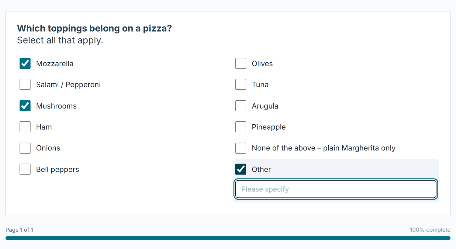
Multiple Choice lets participants tick one or more options. It renders as checkboxes. Use it when answers
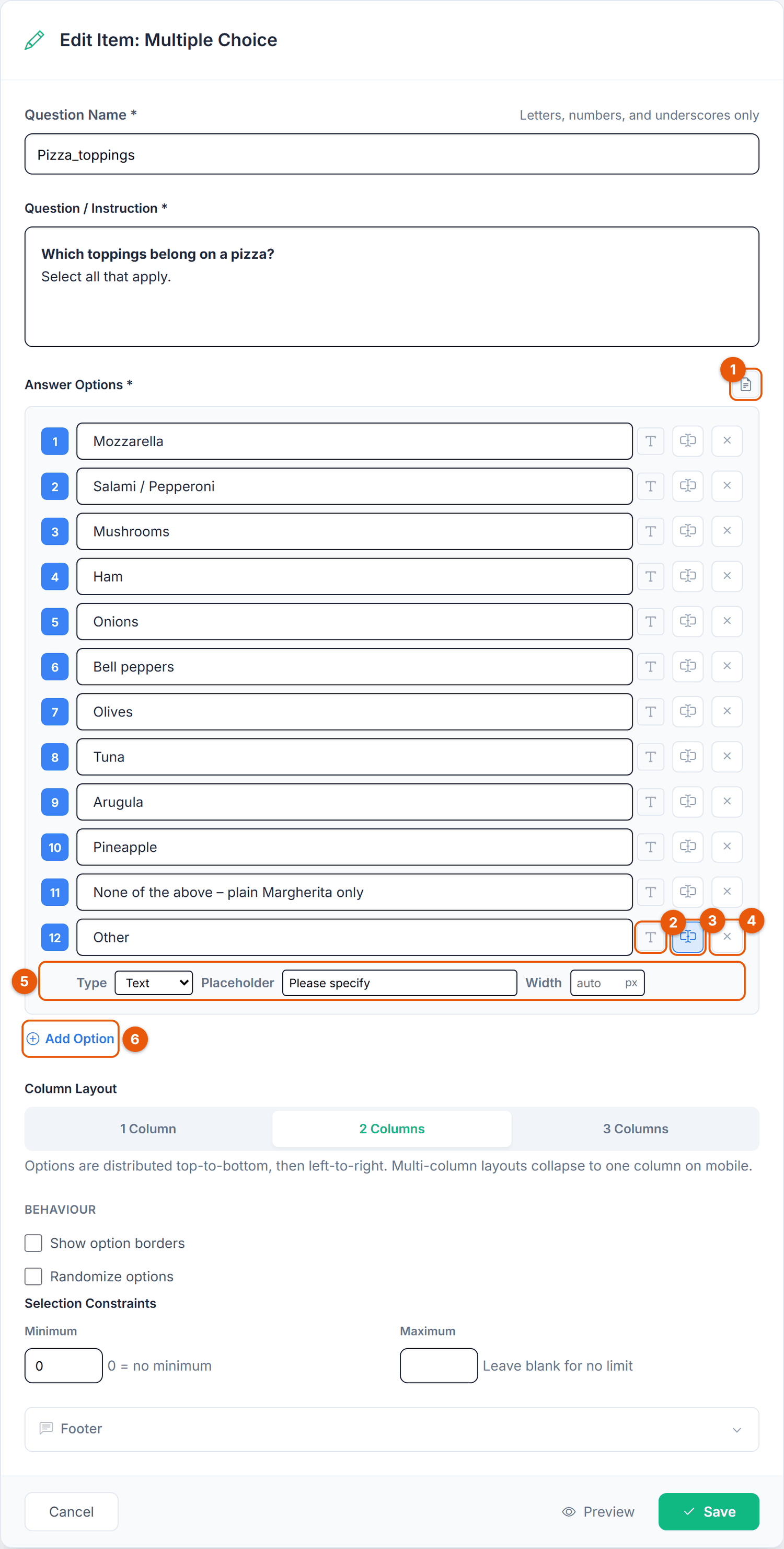
are not mutually exclusive. The Pizza Pizza_toppings item asks which toppings belong on a
pizza, in two columns, with an "Other" option whose specify field opens when the box is ticked.
Pizza_toppings).| No. | Button | What it does |
|---|---|---|
| 1 | Import from TXT | Replaces all options with the lines of a text file. |
| 2 | T Formatting | Formats this option or inserts an image into it. |
| 3 | Add specify text input | Makes this option an "Other, please specify" option. In the Pizza item it is switched on for option 12 "Other" (blue button). Write the option text yourself, for example "Other" or "Something else". |
| 4 | Remove option | Deletes the option. |
| 5 | Specify settings | Type (Text or Number), Placeholder and Width of the follow-up field. |
| 6 | Add Option | Adds an empty option at the end. |
| Option | Description | Default |
|---|---|---|
| Question / Instruction * | Required for this type. | Empty |
| Answer Options * | The checkboxes. Any option can carry a specify field. | 3 empty |
| Column Layout | 1, 2 or 3 columns. | 1 Column |
| Show option borders | Draw a border around each option row. | Off |
| Randomize options | Shuffle the option order per participant. All options take part, including "Other" and "None of the above". | Off |
| Selection Constraints | A Minimum (0 = no minimum) and a Maximum (blank = no limit) number of ticked boxes. | Minimum 0, no Maximum |
Multiple Choice has no separate Required checkbox. To make the question required, set the Minimum to 1 or higher. A "None of the above" option is an ordinary checkbox: it does not untick the other boxes, so check such combinations in your analysis.
Each option is stored under its own key: {item_id}_ao1, {item_id}_ao2, and so on, with 1 for ticked and 0 for not ticked. An option with a specify field adds {item_id}_o{n}_specify. In the export, each option becomes its own column, so you can cross-tabulate any single topping.
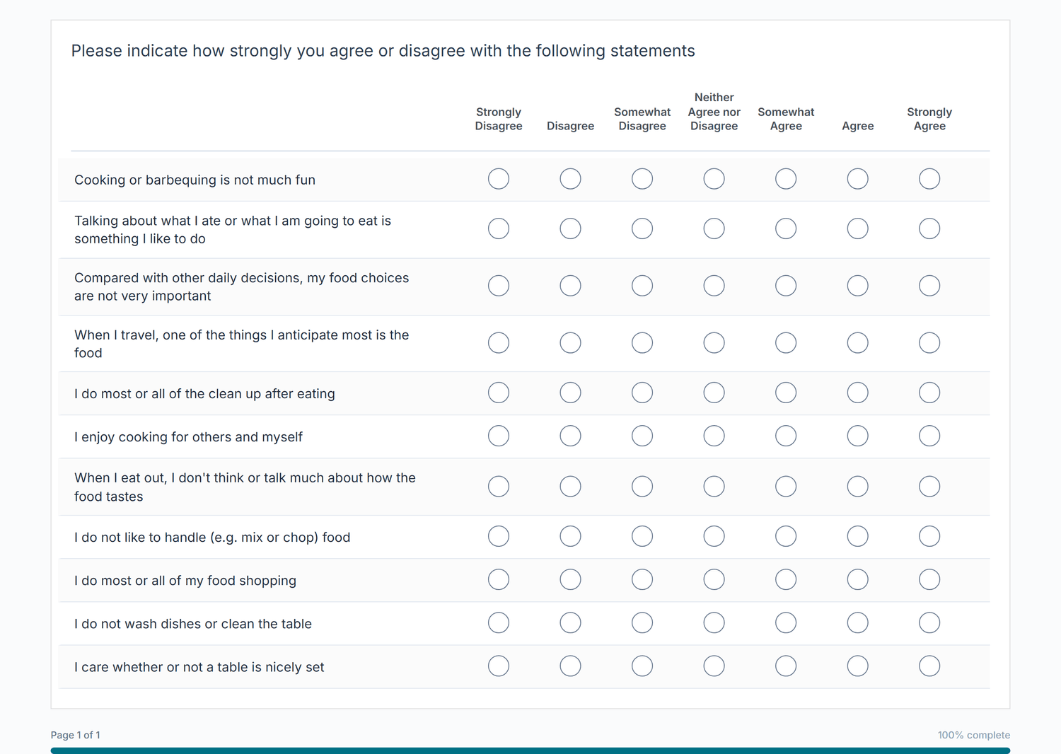
A Grid (Likert) item presents several statements as rows and a shared scale as columns. Participants rate
every row on the same scale, which is ideal for agreement, satisfaction, or importance batteries. The Pizza
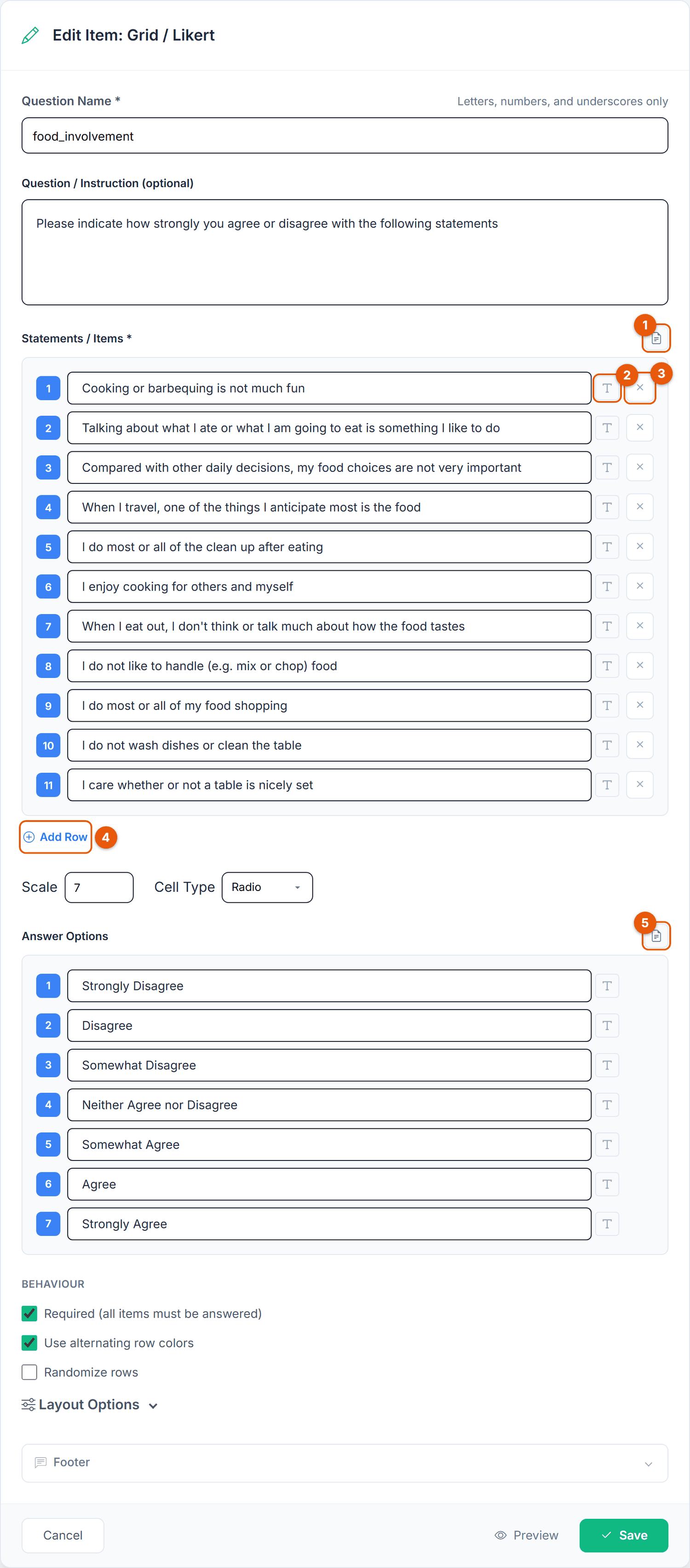
food_involvement grid rates eleven statements on a 7-point Strongly Disagree to Strongly Agree
scale.
food_involvement).| No. | Button | What it does |
|---|---|---|
| 1 | Import statements | Replaces the statements with the lines of a text file. |
| 2 | T Formatting | Formats this statement. |
| 3 | Remove row | Deletes the statement. |
| 4 | Add Row | Adds a statement at the end. |
| 5 | Import answer options | Fills the scale labels from a text file with 2 to 10 lines and sets Scale to the number of lines. |
| Option | Description | Default |
|---|---|---|
| Statements / Items * | The statements to rate (1 to 100). Each row becomes a sub-question. | 3 empty |
| Scale | The number of scale points (2 to 20). Determines how many columns the grid has and how many label fields appear under Answer Options. | 5 |
| Cell Type | Radio (one answer per row), Checkbox (any number of cells per row), or Numeric. | Radio |
| Answer Options | The label of each scale point, for example Strongly Disagree to Strongly Agree. Every label is optional, so you can label only the two ends; answers are stored as the scale value either way. | Empty |
| Required (all items must be answered) | Whether every row must be answered. | On |
| Use alternating row colors | Shade every other row for readability. | On |
| Randomize rows | Shuffle row order per participant to reduce primacy and recency effects. | Off |
The collapsible Layout Options group controls the visual detail. Text and spacing (Font Size, Row Padding) applies everywhere. Table (larger screens) holds Items Column Width (%) (10 to 80, default 45), Column Headers Alignment, Response Cell Width and Sticky Header for long grids; it only affects the table view.
With seven long labels, the header text can become cramped. Lower Items Column Width and set Response Cell Width to Wide (80px) or Extra Wide (100px), as in Figure 11, then check the result with Preview.
With Cell Type Radio, each row is stored as {item_id}_i1, {item_id}_i2, and so on, and the value is the numeric scale position (1-based). Each row becomes its own export column. With Cell Type Checkbox or Numeric, every grid cell gets its own key, {item_id}_i{row}_c{column}.
A Bipolar Scale (semantic differential) places opposing words at each end of a scale and asks participants
where their impression falls. The Pizza Pizza_experience item rates the last delivery on eight
pairs such as Cheap / Expensive and Slow / Fast, using a 7-point slider.
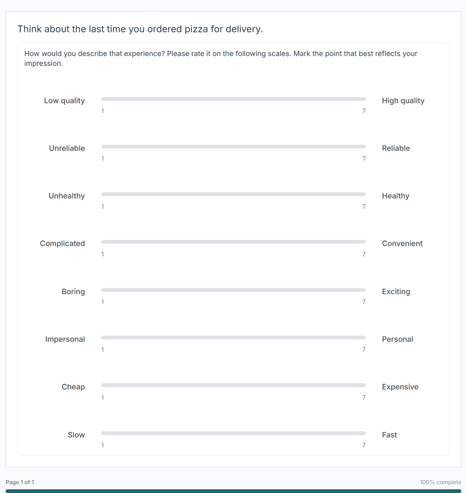
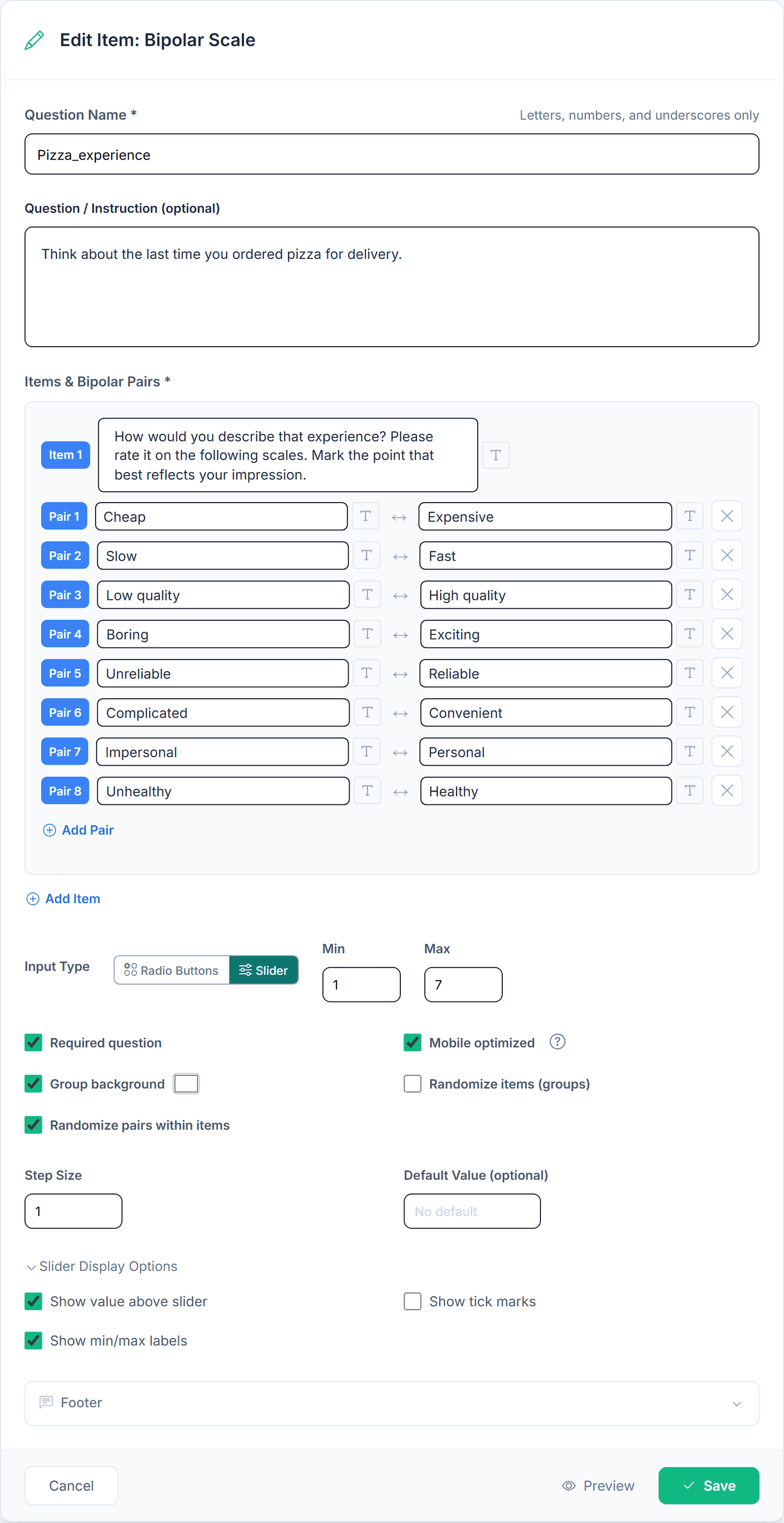
Pizza_experience).| Button | What it does |
|---|---|
| Item card | Pairs are grouped into items. Each card has an "Item N" badge and an item text, for example the instruction above the pairs. |
| Left / Right | The two opposing words of a pair ("Pair N"). Both have a T Formatting button. |
| Remove pair | Deletes the pair (shown when an item has 2 or more pairs). |
| Add Pair | Inside the card: adds a pair to this item. |
| Add Item | Below all cards: adds another item group. |
| Remove item | Deletes a whole item card (shown when there are 2 or more items). |
| Input Type | Radio Buttons or Slider, followed by Min and Max. |
| Option | Description | Default |
|---|---|---|
| Input Type | Radio Buttons or Slider. Radio buttons are limited to 12 scale points. | Radio Buttons |
| Min / Max | The numeric ends of the scale, for example 1 to 7, 0 to 10 or -3 to 3. Both lie between -100 and 100. Radio buttons show at most 12 points; a slider can use the full range (for example -100 to 100). | 1 and 7 |
| Slider options | Only with Slider: Step Size, an optional Default Value, and under Slider Display Options: Show value above slider, Show tick marks, Show min/max labels. | Step 1, no default value, display options off |
| Required question | Whether every pair must be answered. | On |
| Mobile optimized | On smartphones sliders use the full width with the words below; radio scales with more than 7 points switch to a slider. | On |
| Group background | Shade each item group, colour selectable. | On |
| Randomize items (groups) / Randomize pairs within items | Shuffle the item groups, or the pairs inside each group, per participant. | Off |
Every pair is stored under its own key, {item_id}_i{item}_p{pair}, for example {item_id}_i1_p1 and {item_id}_i1_p2. The value is the numeric scale position (Min at the left word, Max at the right). Untouched sliders store nothing rather than the browser's default midpoint.
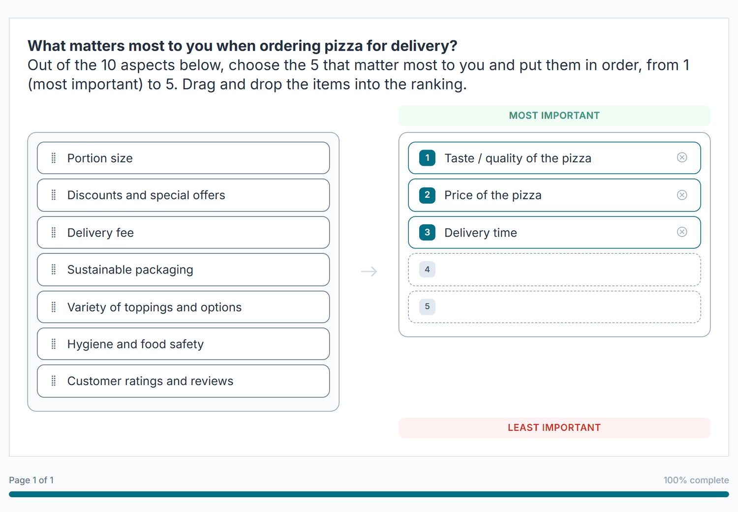
A Ranking item asks participants to put a set of items in order of preference or importance. The Pizza
pizza_order_ranking item lists ten aspects of ordering pizza and asks for the top 5
(Ranking Mode Top N, Interaction Style Drag & Drop).
With Drag & Drop, the computer view has two panels. On the left is the pool of all items, each with a grip handle. On the right are the numbered ranking slots between the top label ("Most important") and the bottom label ("Least important"). Participants drag an item from the pool into a slot; a placed item gets its rank number and an button that sends it back to the pool. Items inside the ranking can be dragged to change their order. With Top N there are exactly N slots, so the Pizza item shows 5 slots for 10 items.
On phones, tablets and narrow windows the same item turns into a tap list (Figure 16). The ranking comes first, headed Your Top 5 with a counter ("2 of 5 selected"), followed by Available items. Participants tap + to add an item to the next free slot, move it by its handle and remove it with ×. A participant who tries to continue too early sees "Please rank exactly 5 item(s) before continuing."
The other Interaction Styles look the same on every device: Reorder shows one list of all items that participants sort (Full Ranking only), and Dropdown gives each item a rank dropdown.
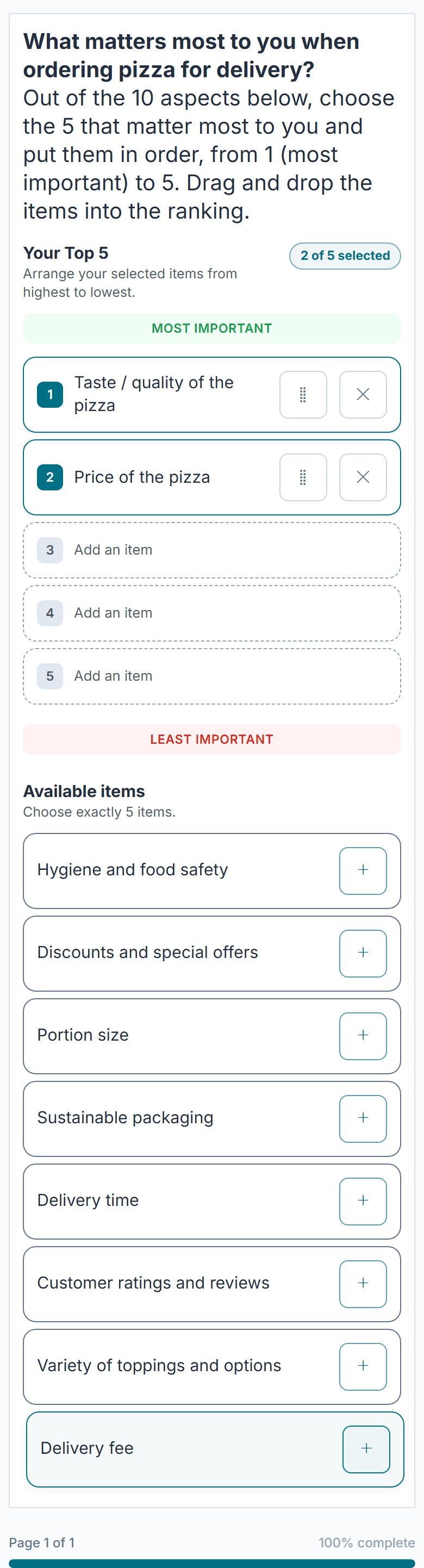
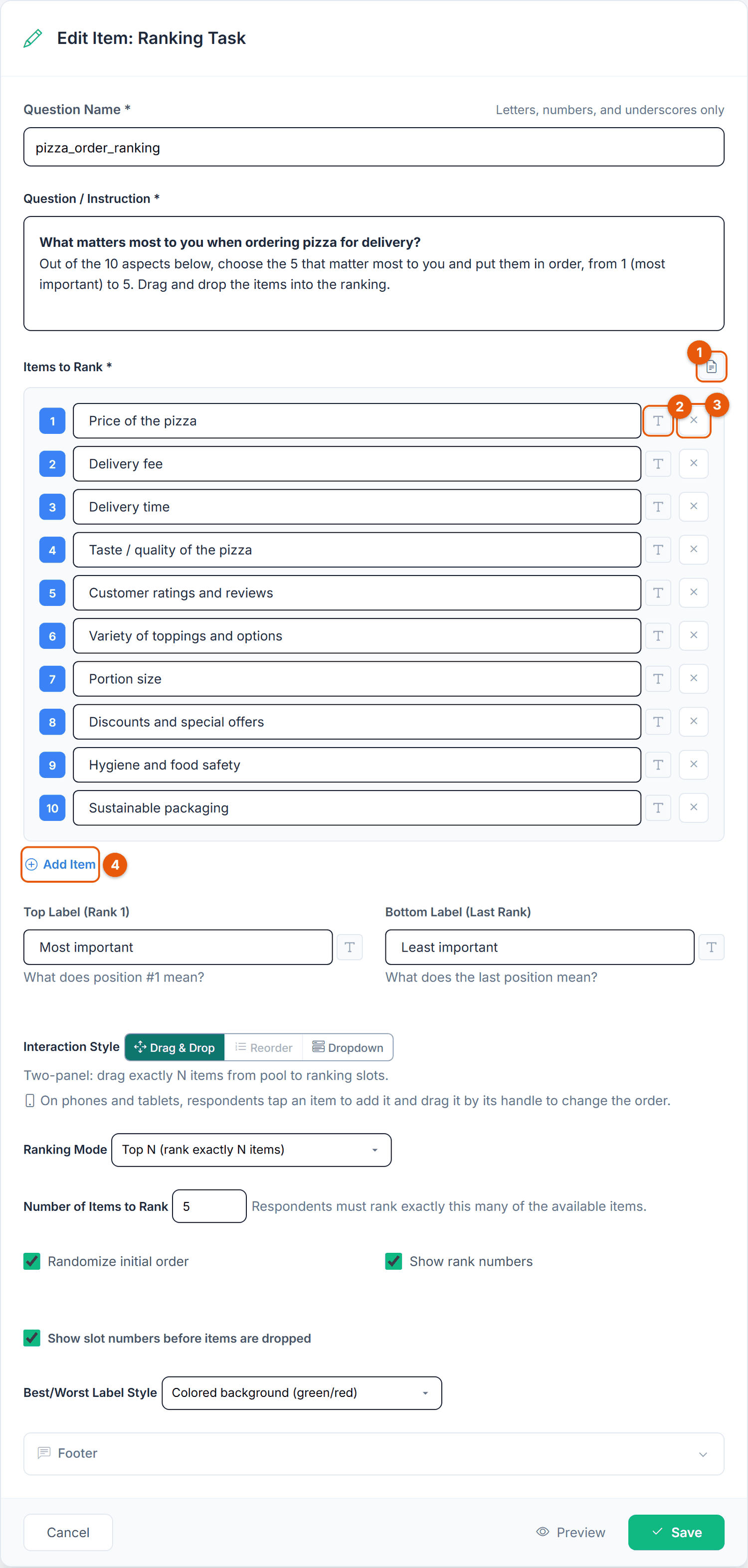
pizza_order_ranking).| No. | Button | What it does |
|---|---|---|
| 1 | Import from TXT | Replaces the items with the lines of a text file. |
| 2 | T Formatting | Formats this item. |
| 3 | Remove | Deletes the item. |
| 4 | Add Item | Adds an item at the end. |
| Interaction Style | Drag & Drop, Reorder or Dropdown. The line below explains the chosen style; the line says how it works on phones. | |
| Ranking Mode | Full, Partial or Top N, with the number field next to it. |
| Option | Description | Default |
|---|---|---|
| Items to Rank * | The things to be ranked, 2 to 30. | 3 empty |
| Top Label (Rank 1) / Bottom Label (Last Rank) | The captions above and below the ranking slots. | Best / Worst |
| Interaction Style | Drag & Drop, Reorder, or Dropdown (see above). Reorder is only available with Full Ranking. | Drag & Drop |
| Ranking Mode | Full Ranking (rank all items), Partial Ranking (rank at least N items) or Top N (rank exactly N items). Partial and Top N reveal a number field (default 3, at most the number of items). With Top N, Dropdown offers the ranks 1 to N. | Full Ranking |
| Randomize initial order | Shuffle the starting order per participant (called "Randomize item order" in the add form). | Off |
| Show rank numbers | Show the position number next to each ranked item. | On |
| Show slot numbers before items are dropped | Drag & Drop only: number the empty slots. | On |
| Best/Worst Label Style | Green/red text, Colored background (green/red), Black, or Project font color. The Pizza item uses Colored background. | Green/red text |
Ranking has no Required checkbox: what counts as a complete answer follows from Ranking Mode. Tell participants in the question text how many items to rank. The Pizza item, a Top 5 of 10, says "Out of the 10 aspects below, choose the 5 that matter most to you and put them in order".
Each item's rank is stored as {item_id}_i1, {item_id}_i2, and so on, in the original item order. The value is the rank assigned to that item (1 = top); items left in the pool stay empty. Each item becomes its own export column. Ranking more than about 7 to 8 items is demanding; for larger sets use Top N or a MaxDiff design.
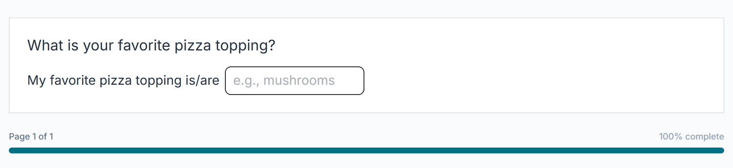
Text Input collects free-text answers. A toggle at the top of the editor switches between
Single Line (names, short phrases) and Multi Line (comments, open-ended
feedback). The Pizza favorite_topping item uses a single line with the lead-in text
"My favorite pizza topping is/are".
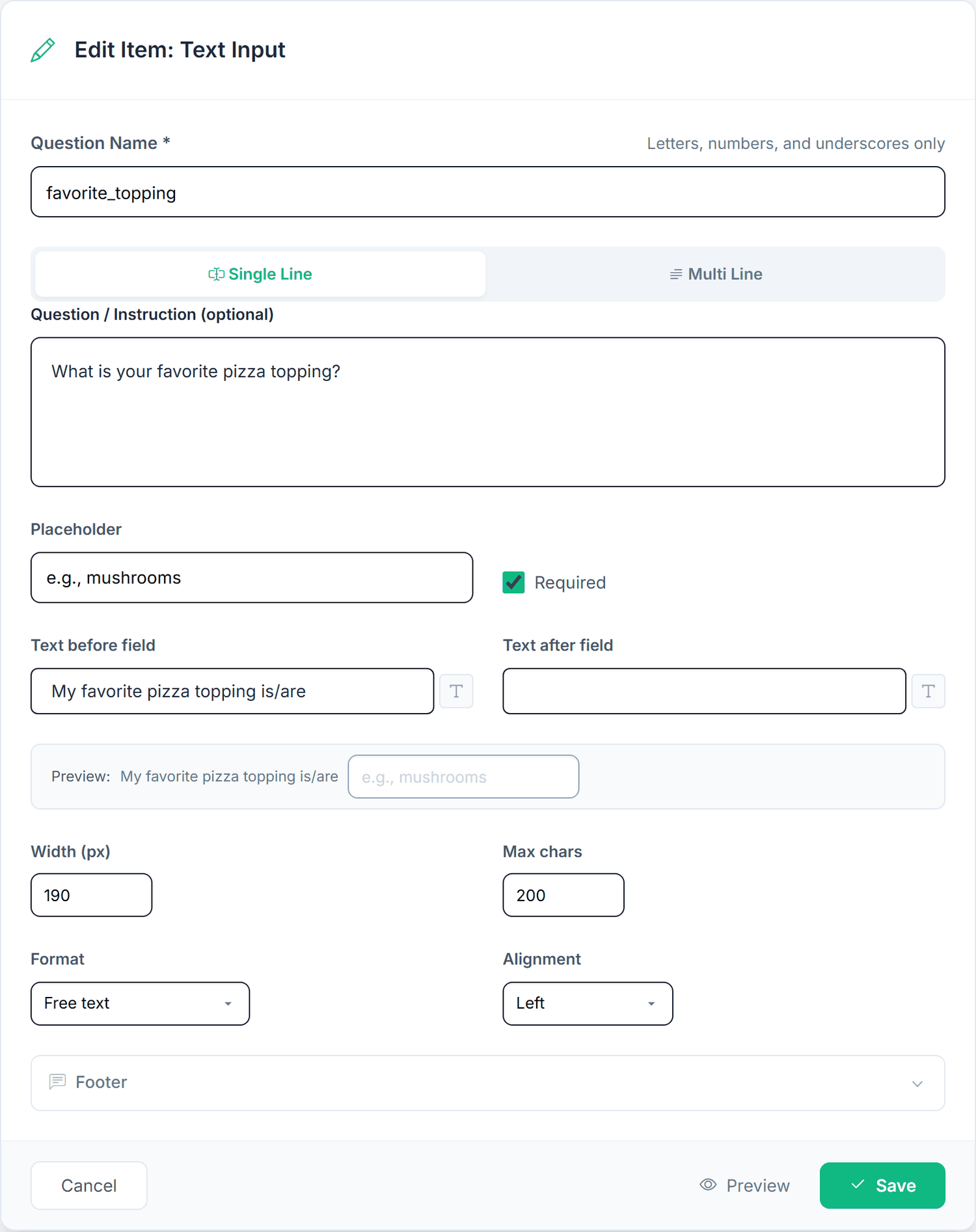
| Field | What it does |
|---|---|
| Single Line / Multi Line | Switches the field type. |
| Placeholder | Grey hint inside the empty field (up to 500 characters). |
| Required | Whether an answer is needed. |
| Text before / after field | Lead-in and trailing text on the same line. The Preview row below shows the result live. |
| Width (px) | 40 to 1000, default 190. |
| Max chars | Up to 500, default 200. |
| Format | Checks the answer against a pattern (table below). |
| Alignment | Left, Center or Right. |
| Format | What it accepts | Example |
|---|---|---|
| Free text | Anything (no format check). | mushrooms |
| Email address | A basic name@domain.tld shape. | anna@example.com |
| Phone number | At least 5 characters of digits with optional +, spaces, brackets, dashes, dots or slashes. | +49 170 1234567 |
| Web address (URL) | A host with a dot, scheme optional. | example.com/menu |
| Date | A calendar date; the server verifies it is real. | 2026-07-03 |
| Custom pattern (regex) | Your own regular expression (Validation Pattern (regex)) plus an Error Message. | [A-Za-z]+ |
The built-in formats are checked in the browser when the participant clicks Next, and again on the server. A custom regex is checked on the server when the page is submitted. Choosing Date hides Max chars, because a date picker does not need it.
Multi Line gives a text box with Height (Rows) (Small 3, Medium 5 as default, Large 8, Extra Large 10, Huge 15), Min Characters and Max Characters (up to 5000), Show character counter (off) and Allow user to resize (on).
Both variants store the entered text under {item_id}. Text is sanitized before storage. Open text is valuable but hard to quantify, so use it as a follow-up ("Please explain your choice") rather than a primary measure.
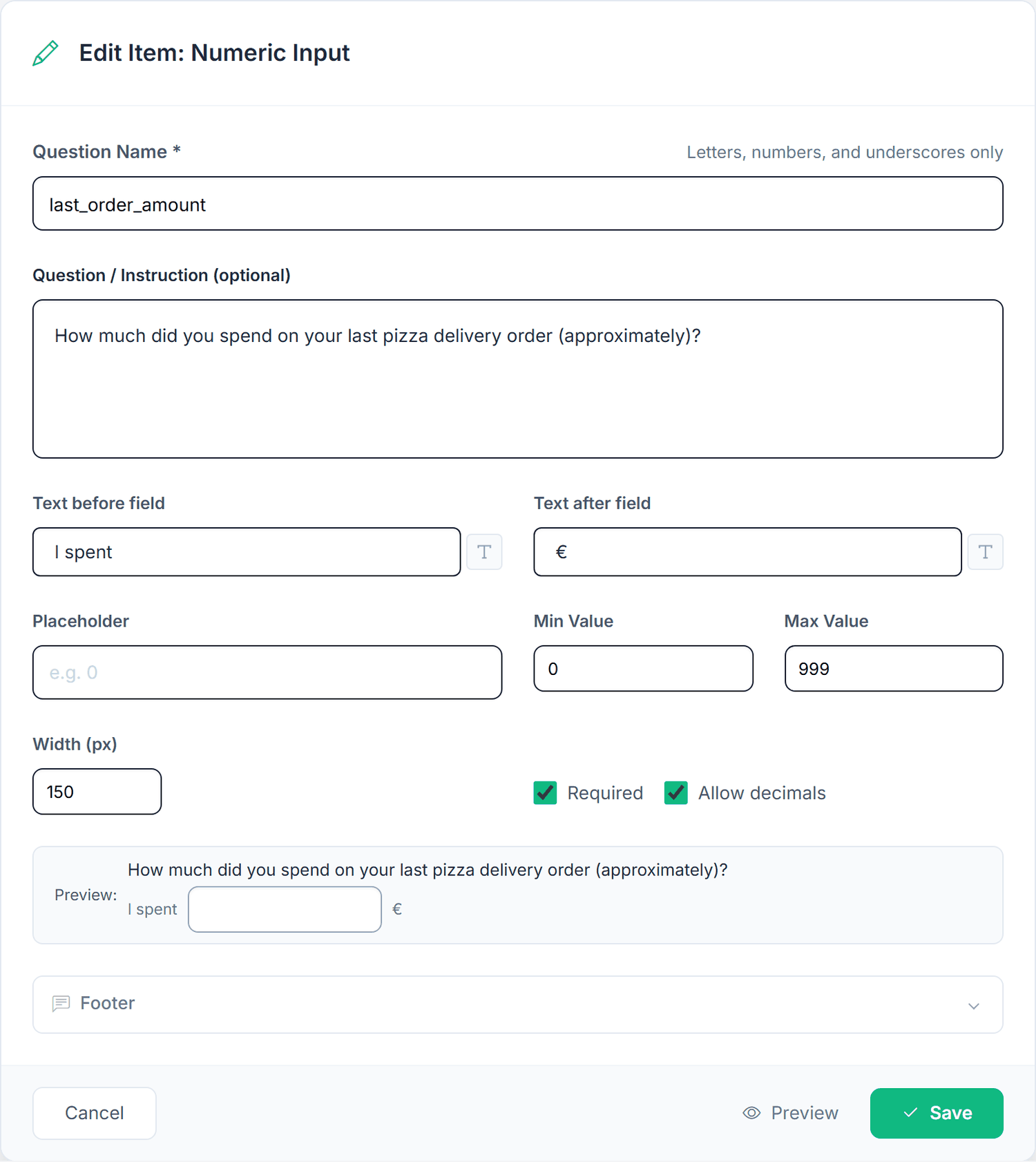
Numeric Input collects a single number and checks it against optional minimum and maximum bounds. You can
wrap the field with lead-in and trailing text. The Pizza last_order_amount item reads
"I spent [ ] €" with bounds 0 to 999, and age reads "I am [ ] years old".
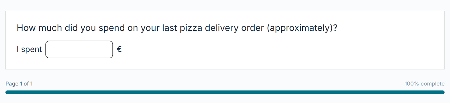
| Field | What it does | Default |
|---|---|---|
| Text before / after field | Lead-in and trailing labels ("I spent" ... "€"). | Empty |
| Placeholder | Grey hint inside the field. | Empty |
| Min Value / Max Value | Values outside the range are rejected. Both within ±1,000,000,000; Min must not exceed Max. | No limit |
| Width (px) | 40 to 1000. | 150 |
| Required | Whether a value is needed. Items created by dragging start with Required on. | Off |
| Allow decimals | Accept fractional values. Which decimal separator participants may type is a project setting (Project Settings, Display & Messages); stored values always use a dot. | Off |
Stored as {item_id} with the numeric value. Always set sensible bounds: an age field without them might receive 999 or -5. For willingness-to-pay questions, a reasonable upper bound keeps outliers from skewing your analysis.
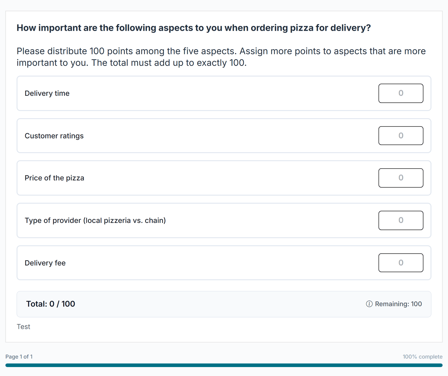
A Constant Sum item asks participants to split a fixed total across several categories, which forces
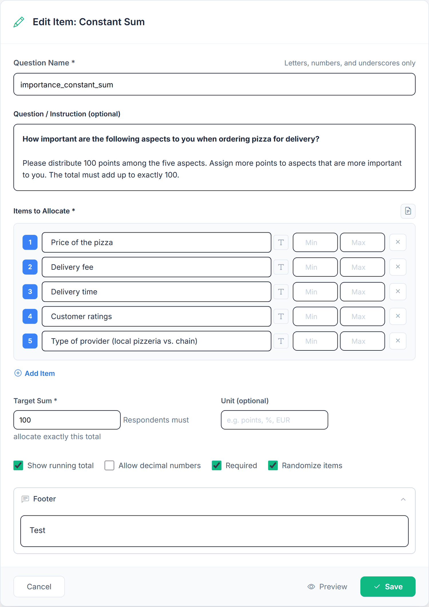
trade-offs. The Pizza importance_constant_sum item distributes 100 points across five aspects
of ordering pizza.
| Field / button | What it does |
|---|---|
| Import from TXT | Replaces the categories with the lines of a text file. |
| Min / Max per row | Optional lower and upper bound for that category (0 to 10,000). |
| / Add Item | Remove a category or add one (up to 100). |
| Target Sum * | The required total, 1 to 10,000 (default 100). |
| Unit (optional) | Short unit next to the fields, for example points, % or EUR (up to 10 characters). |
| Checkboxes | Show running total (on), Allow decimal numbers (off), Required (on), Randomize items (off). |
Each category is stored as {item_id}_1, {item_id}_2, and so on (no i prefix), with the number allocated. Use 100 for percentage-like weights, or a concrete figure (a 10,000 € budget) for realism. Keep categories under about 8 to avoid overload.
The Custom HTML item inserts your own markup into the survey, for content the standard editors cannot produce, such as a specialized widget or an interactive layout. It is a power-user feature.
name becomes the variable.| Field / button | What it does |
|---|---|
| Safe HTML subset, Guide | A box at the top lists what is Allowed, what is Blocked and how data capture works. Guide opens the Custom HTML tutorial. |
| Starter example | A collapsible example to copy from. |
| Question / Instruction (optional) | Rich text shown above the HTML. |
| Variable Definitions | One row per survey variable this item fills: Variable Name *, Type * (Text, Numeric, Radio, Checkbox), Required, and for Numeric also Allow Decimals and Min / Max. Up to 100 per item and 300 per project. |
| Scan HTML | Finds every input, textarea, select and hidden field with a name= and adds it as a variable. |
| Add manually | Adds an empty variable row. |
| HTML Content * | The markup, up to 100,000 characters. Sanitized on save: scripts, event handlers, iframes, embeds, form wrappers and external URLs are removed. |
| CSS Styles (optional) | CSS scoped to this item, up to 12,000 characters, also sanitized. |
If the fields in your HTML and the declared variables do not match, Save asks first ("HTML fields and variables do not match") with Save anyway and Back to editor.
For allowed tags, the sanitization pipeline and capturing values, see the Custom HTML tutorial.
Storage: each value is stored under its declared variable name (up to 5000 characters). With no variables declared, the item is display-only like Text & Media.
Market Research is a single item type that hosts three classic research methods. You add one
"Market Research" item, then pick the method with a card under Research method. Each method has its own
settings, its own participant experience, and its own analysis in the results. The Pizza study includes all three:
KANO_Pizza, VanWest_Pizza, and GaborGranger_pizza.
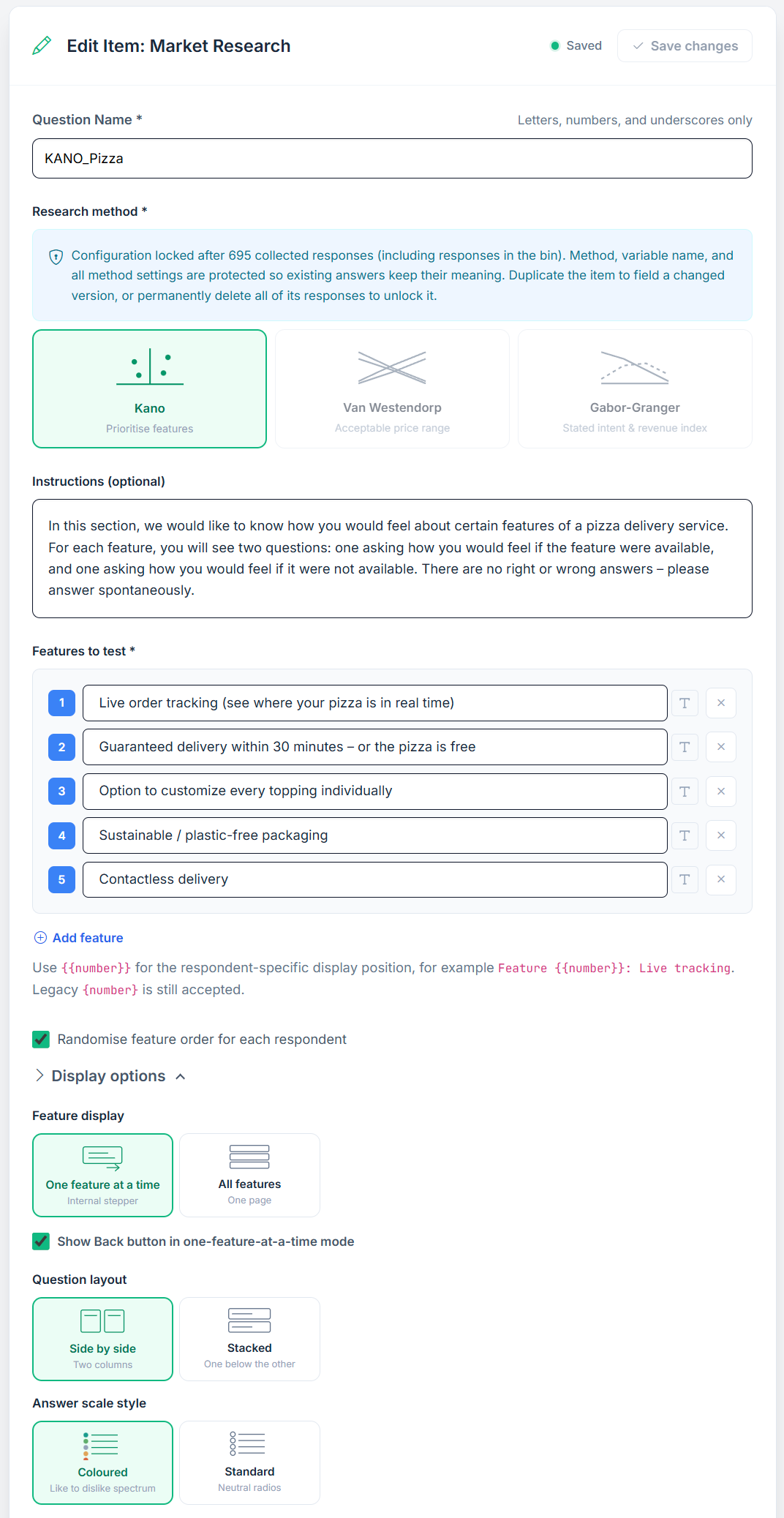
Once the item has collected at least one response (responses in the bin count too), the method, the variable name and all method settings lock so stored answers keep their meaning. A lock note explains this. To field a changed version, duplicate the item; to unlock, permanently delete all of its responses.
All three methods accept display logic like any other question (Add Display Logic in the card footer). Because a Market Research item has its own page, a hidden item means the whole page is skipped, forward and backward; respondents never see an empty page. If a respondent answers the item, goes back and changes the filter answer so the item is hidden, the earlier answer is removed. A Market Research item can still not be the source of a logic rule.
Kano finds out how much each feature actually matters. For every feature the participant answers two questions: how they would feel if the feature were present (functional), and how they would feel if it were not (dysfunctional). The pair classifies the feature as Must-be, Performance, Attractive, Indifferent, and so on. The Pizza item tests five delivery features, one at a time.
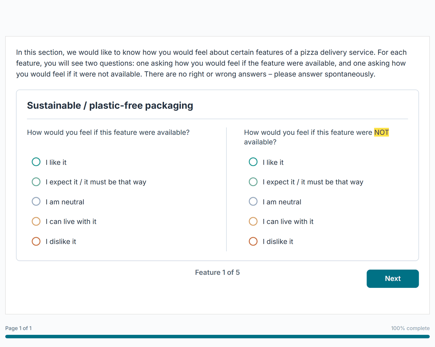
| Setting | Description |
|---|---|
| Features to test * | The features to evaluate, 2 rows to start, up to 60, added with Add feature. Feature texts may contain images. A checkbox below the list, Randomise feature order for each respondent, is on by default. |
| Feature display | One feature at a time (default, with "Show Back button in one-feature-at-a-time mode") or All features on one page. |
| Question layout | Side by side (default) or Stacked. |
| Answer scale style | Coloured (default, like-to-dislike spectrum) or Standard. |
| Wording | Both question texts, the five answer labels, and the stepper texts (Next and Back labels, progress text, required-answer message) are editable. Empty Next/Back labels use the texts from Project Settings. |
| Instructions (optional) / Required | All three methods share an optional Instructions field and a Required (participant must answer) checkbox (on by default). |
For each feature f the export writes three columns: {var}_f{n}_functional, {var}_f{n}_dysfunctional (both coded like / expect / neutral / tolerate / dislike), and {var}_f{n}_category (A, O, M, I, R, or Q). The results page also plots each feature on the Better/Worse quadrant.
The Van Westendorp Price Sensitivity Meter asks four price questions about one concept: at what price it becomes too cheap, a bargain, expensive, and too expensive. Crossing the resulting cumulative curves yields a perceptual acceptable range and the historical OPP, where equal shares consider the price too cheap and too expensive. OPP is a minimum-resistance balance, not a revenue- or profit-maximizing price. The Pizza item prices a medium Margherita.
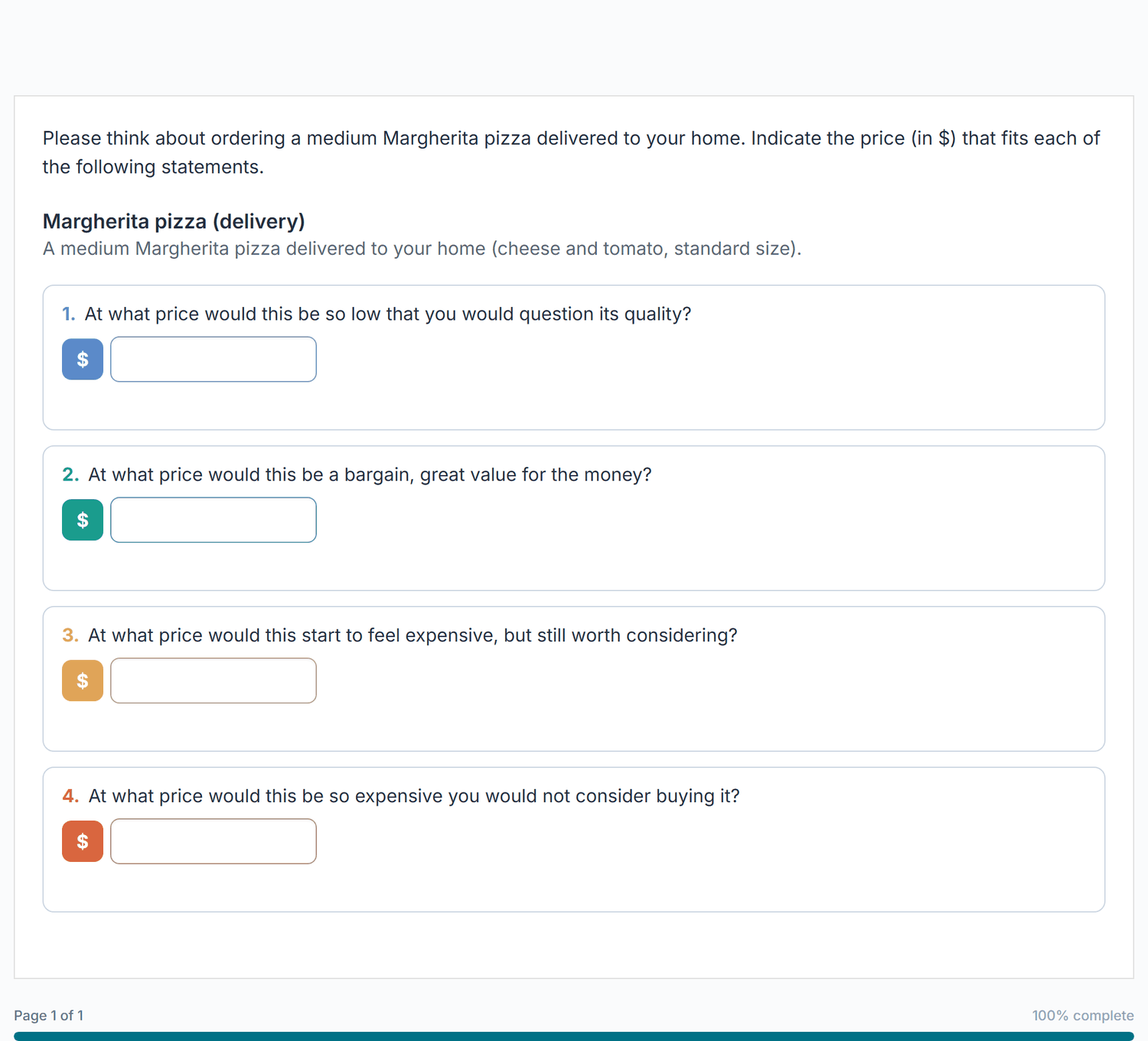
| Setting | Description |
|---|---|
| Concept name / Concept description | Optional name and description of what is being priced (shared with Gabor-Granger). |
| Currency code / Currency symbol / Currency symbol position | Defaults USD and $, symbol Before (€39.00) or After (39,00 €). Which decimal separator participants may type follows the project setting. |
| Minimum price / Maximum price | Prices outside are rejected. Defaults 0 and 100000. |
| Price fields | Coloured cards (default) or Plain. |
| Question texts | The wording of the four questions (Too cheap, Bargain, Expensive, Too expensive). |
| Require an increasing price order | On by default: too cheap < bargain < expensive < too expensive. A second checkbox, Allow equal adjacent prices, relaxes this to non-decreasing. |
| Qualifying question | Off by default. Ask a qualifying question first puts one question with five answers (Definitely would buy ... Definitely would not buy) above the price questions. Counts as qualified sets the threshold (default "Definitely or probably"). Only qualified respondents see the price questions; the others go straight on with Next. Question and answer labels are editable. |
| Purchase likelihood (Newton-Miller-Smith) | Off by default, available only when Require an increasing price order is on. Ask purchase likelihood at the respondent's own prices adds a second step: after the four prices the respondent selects Continue and answers two five-point questions, one at their own bargain price and one at their own expensive price ({{price}} in the question text becomes that price). Change prices goes back to the price fields and clears both answers. Question texts, answer labels and both button texts are editable. |
The four prices export as {var}_p1_too_cheap, {var}_p2_bargain, {var}_p3_expensive, and {var}_p4_too_expensive. With a qualifying question, {var}_qualifier holds the answer code (price columns stay empty for respondents who did not qualify); with NMS, {var}_p5_nms_bargain and {var}_p6_nms_expensive hold the two purchase answers. The results page plots the crossing curves, reports PMC/PME only when their boundaries are identified, preserves crossing plateaus as intervals, and labels OPP as a perceptual balance rather than an economic optimum.
Gabor-Granger shows one configured price at a time and asks whether the participant would buy at that price. In Choicery's sequential-adaptive mode, a "yes" moves to the next higher tested price and a "no" to the next lower one until the path reaches a ladder boundary or reverses at an adjacent level. The completed path records the highest accepted tested price, not an exact personal willingness-to-pay ceiling. Under the monotone reservation-price assumption, adjacent yes/no decisions bracket a switching interval; all-yes and all-no paths provide one-sided bounds. Across valid responses, Choicery estimates stated would-buy shares and a revenue index (price × stated share) at the configured levels. These are directional survey indicators, not sales or profit forecasts. The Pizza item tests six price levels from $7.90 to $17.90.
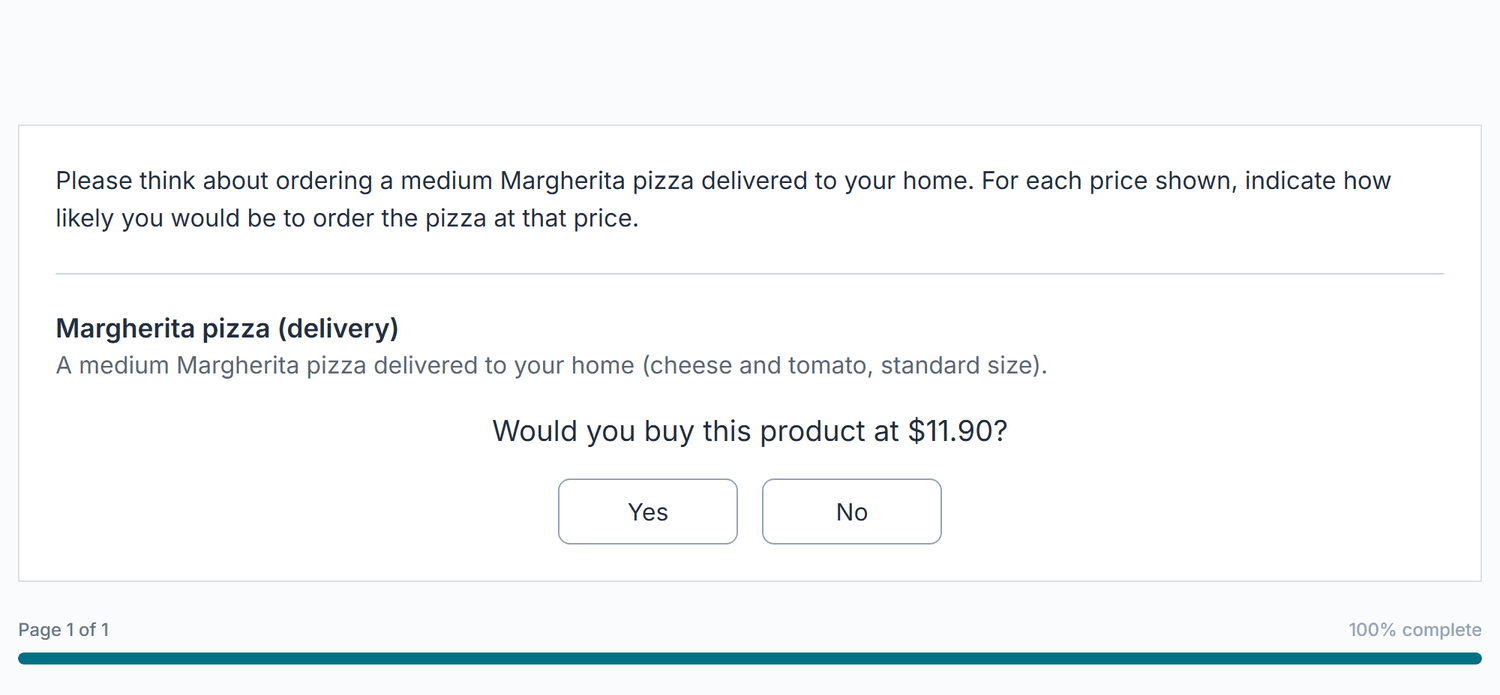
| Setting | Description |
|---|---|
| Sequential start strategy | Fixed midpoint (default) starts everyone at the same middle price (the lower of the two middle levels for an even number of levels). Balanced randomized start uses reproducible participant-ID-aligned permuted blocks across the middle third of the ladder and needs at least four price levels. A release can begin or end inside a block, and counts among completed, analyzable responses can also differ after item skips, dropout, or exclusions. |
| Price levels to test * | The prices to test, up to 10 (default 19, 29, 39, 49, 59), added with Add price level. 4 to 7 levels work well. |
| Purchase question | The wording, with {{price}} replaced at each step (default "Would you buy this product at {{price}}?"). |
| Answer scale | Yes / No (default) or 5-point purchase intent (Definitely would buy, Probably would buy, Might or might not buy, Probably would not buy, Definitely would not buy). With 5 points the participant sees five buttons stacked; a click answers and moves to the next price. Counts as buying sets which answers move to the next higher price (default "Definitely or probably"); any other answer moves to the next lower price. |
| Yes label / No label | Custom labels for the two buttons (Yes / No scale). With 5 points, the five answer labels are editable instead. |
| Qualifying question | Same as in Van Westendorp: one five-point question before the prices, with Counts as qualified. Only respondents who qualify get the price questions. Once the first price is answered, the qualifying answer can no longer be changed. |
| Completion message (optional) | Text shown once the price path is finished. |
Use few, clearly separated prices (4 to 7 levels). Prices that differ by only a few cents produce answers that cannot be told apart.
Each respondent exports {var}_start_price and {var}_start_assignment_policy (the assigned start price and the policy that assigned it), {var}_max_accepted_price (the highest tested price accepted in the recorded path, blank if none; it is not exact personal willingness to pay), and {var}_price_path_json (the full sequence of tested prices and answers). With the 5-point scale, {var}_price{n}_intent holds the answer at each price level (blank if not asked); with a qualifying question, {var}_qualifier holds its answer code. The results page reports analyzed start counts, stated purchase-intent shares, and the revenue index. It marks a single strongest tested price only when the configured ladder is fully estimable, stated demand is positive, and the index maximum is unique.
On the Market Research results page (Analysis > Survey Analysis), Group by splits the selected item by a grouping variable: a nominal or ordinal question (as set in Variable Config), a variable added in the Data Editor, a Latent Class segment, or the experimental condition. Up to 12 groups are allowed. A comparison table then shows one column per group, a No answer column for respondents without a value, and All. Each cell shows the value, its 95% bootstrap interval and n. Show charts for switches the charts to one group; Gabor-Granger demand, NMS likelihood and Kano Better/Worse also get an overlay with one line or colour per group. The intervals describe the uncertainty within each group; this is not a significance test, and overlapping intervals do not prove that two groups are equal.
The Evaluation item presents a set of options as cards and asks participants to react to them: choose one,
rate them, allocate points, or rank them. It has its own full-page editor rather than the standard item
editor. The Pizza delivery_service_eval item shows three delivery offers and
asks which one the participant would choose, with a "None of these" option.
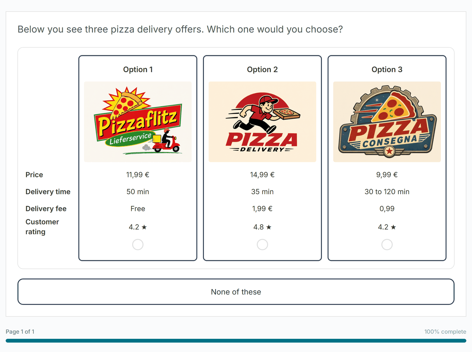
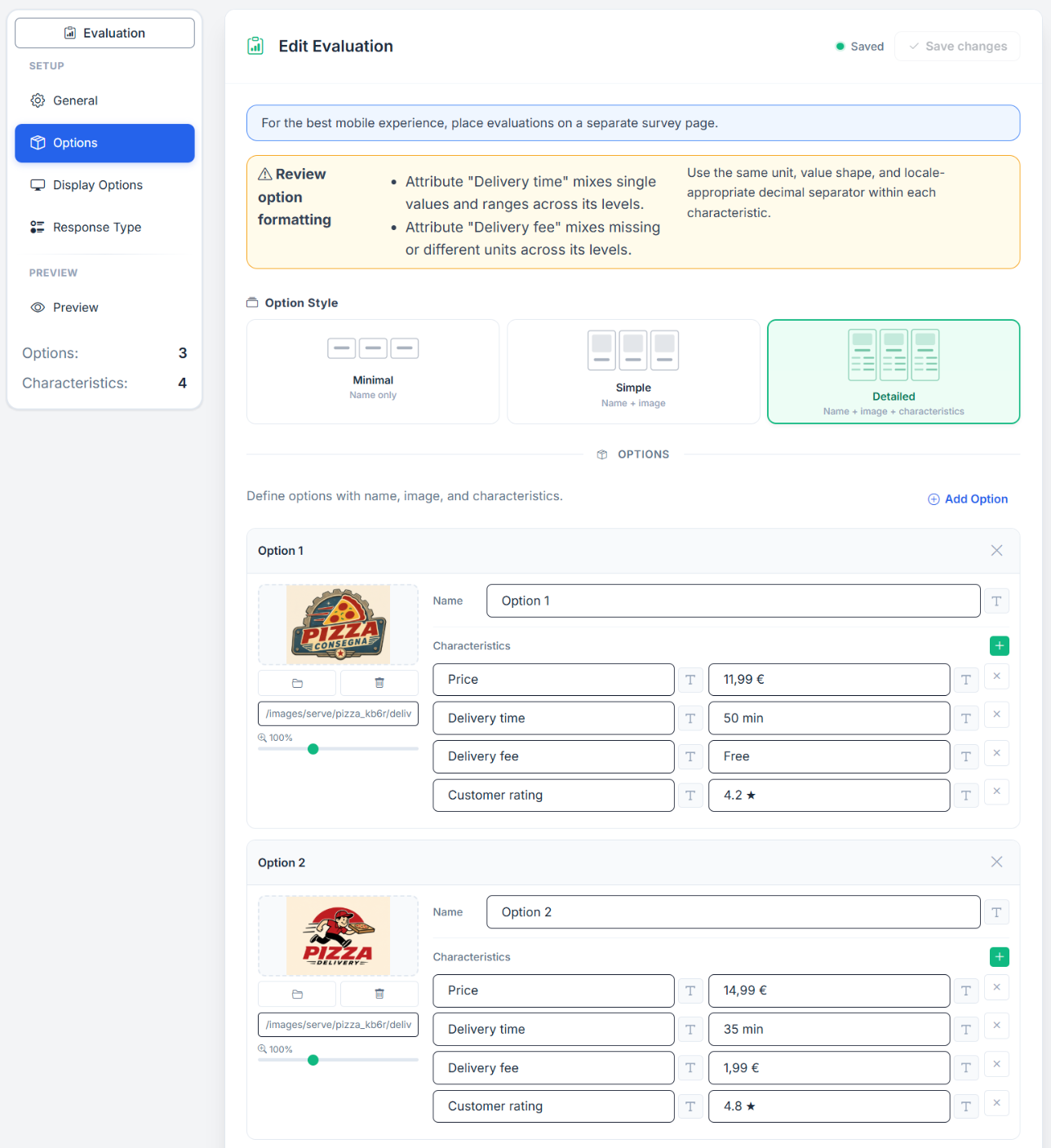
| Step (left rail) | What you set there |
|---|---|
| General | Task Name (Internal) * (default "evaluation", up to 50 characters), Question / Instruction, Required (on), Randomize option order (off), Footer. |
| Options | Option Style (Minimal, Simple, Detailed) and the option cards. Add Option sits above and below the list. Each card has a name, an image (Browse Images, Remove Image, Image URL, zoom 50 to 200 percent, crop) and characteristic rows with their own add button. A new card copies the characteristic labels of the previous one. Up to 20 options with up to 20 characteristics each. |
| Display Options | Layout Style: Horizontal (default), Vertical or Compact Grid. Card Appearance (not for Vertical): Options per Row (Auto or 2 to 5) and Card Width (160 to 640, default 280). Image Settings: Image Height (default 120), Aspect Ratio, Enable image zoom on click (on). Option Name: Display option name (on). |
| Response Type | Single Choice (Pick one), Multiple Choice (Select multiple, with Min / Max Selections), NPS (0-10 Scale, end labels "Not at all likely" / "Extremely likely"), Star Rating (2 to 10 stars), Slider Rating (Min, Max, Step, Start Position, labels, Show current value), Constant Sum (Total Points, allocation instruction) or Ranking (Order by preference). For Single and Multiple Choice also: Include "None of these" option and Click anywhere on card to select (if off, a Select button with editable text appears). |
| Preview | The live participant view, with Refresh. |
The header shows the save state and the Save evaluation / Save changes button, which stays disabled until something changed. Live counters in the rail show how many options and characteristics you have.
With Response Type Single Choice, the answer is stored as {item_id}: 0 when "None of these" is chosen, or 1 to N for the selected option. All other response types store one key per option, {item_id}_p1, {item_id}_p2, and so on, plus {item_id}_none. Evaluation is a standalone survey question and does not require a conjoint design.
The Conjoint section of the Add Item panel holds the choice-based tasks, the core of Choicery. They work differently from the survey questions above: instead of a single question, you design a set of attributes and levels, Choicery builds an experimental design, and each task shows the participant competing product profiles to choose between. Conjoint tasks always take their own pages, and their results drive the analysis tools (HB utilities, market simulation, willingness to pay, and so on).
Each conjoint type has its own attribute setup, task layout, and analysis, so each one has its own detailed manual. Open the manual for the type you are building:
Storage: conjoint responses expand into one export column per task, named from the task type and the task name you assigned. CBC writes conjoint_{task name}_t1, MaxDiff writes maxdiff_{task name}_t1_best and _t1_worst, DR-CBC and Best-Worst CBC add their _none columns, and fixed holdout positions are labelled FIXED_t{n}. The same responses are converted to long format for HB estimation. Each manual documents the exact schema and the analysis workflow.
Page breaks, end pages, quotas, logic, and survey-design best practices.
A Page Break starts a new page. In the editor it does not appear as a card but as the header of the next page (see Figure 1). Add one with New Page / Page Break in the Add Item panel (inserted immediately) or with Add Page at the end of the flow; remove one with Remove Page Break. Page breaks collect no data and are invisible to participants.
Aim for 3 to 5 questions per page. Too many overwhelms respondents; too few creates excessive clicking. Conjoint and Market Research items always get their own page automatically.
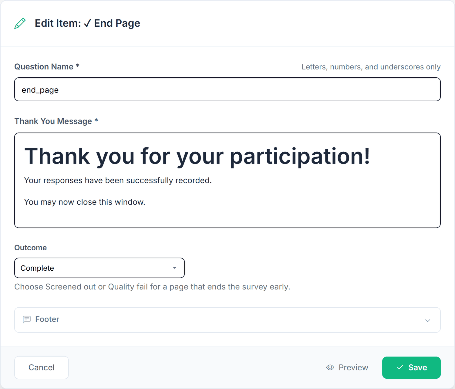
An End Page is a final screen, usually a thank-you message. Reaching it ends the survey. Every End Page sits alone on its own page. A survey can have several End Pages, for example one thank-you page for people who finished and one "Thank you, unfortunately you do not belong to our target group" page for people who were screened out. Skip logic can jump to a specific End Page. Items placed after the last End Page are never shown, and the editor warns about them.
| Field | What it does |
|---|---|
| Thank You Message * | Rich text shown on the page (called Thank You Content in the add form). Prefilled with "Thank you for your participation! Your responses have been successfully recorded. You may now close this window." |
| Outcome | How a response that reaches this page is counted: Complete (default), Screened out or Quality fail. Use the last two for pages that end the survey early. |
| Outcome | Set by | Response status | Counts for analysis and quotas |
|---|---|---|---|
| Complete | An End Page with outcome Complete | complete | Yes |
| Screened out | An End Page with outcome Screened out | incomplete | No, kept apart (not a dropout) |
| Quality fail | An End Page with outcome Quality fail | incomplete | No, kept apart (not a dropout) |
| Quota full | A full quota or the Maximum Responses limit (section 19) | incomplete | No, kept apart (not a dropout) |
Screened out, Quality fail and Quota full responses never enter the analysis, the dropout figures or the quota counts. The Analysis overview shows them as separate tiles ("Screened", "Quality", "Quota full") and lists them below the funnel as "Ended by the survey and not counted as dropoffs". On an End Page with outcome Screened out or Quality fail, participants see the heading "Survey Ended" instead of "Survey Completed". The preview of an End Page says how respondents reaching it will be marked.
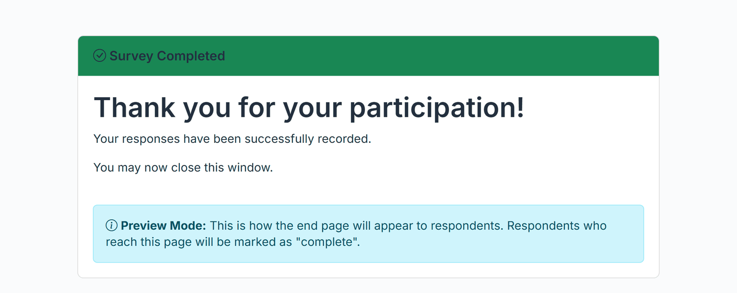
The skip target End Survey (Skip to end) always ends with the outcome Complete (it uses the first End Page set to Complete). To record a screen-out, for example after a declined consent, add an End Page with the outcome Screened out and choose that page as the skip target. The survey also cannot start with an End Page; publishing is refused with "The survey cannot start with an end page."
Storage: the outcome is saved with the response and exported in the column outcome (or response_outcome if a question is already called outcome), with the values complete, screened, quality or quota_full: <quota name>. The column sits in the system block at the right of the export; it is empty for older responses recorded before outcomes existed.
A quota limits how many completed responses each answer of a single-choice question may collect, for example 150 men and 150 women. Once a group is full, further participants in that group end the survey. Quotas are not set in the survey editor but in the project settings: top navigation Settings, section Fieldwork, entry Quotas (between Availability and Privacy).
Click Add quota (later Add another quota). A new block opens.
Under Question, choose the single-choice question whose answers the quota limits. Only Single Choice questions without a quota are offered. The table of answer options appears.
Enter a Target for each answer that should be limited. Leave a field empty ("no limit") for answers without a limit. 0 is allowed and closes that group from the start. Optionally change the Name; without one the quota is named after the question.
Click Save quotas. Quotas apply at once, also in a running survey, without publishing again.
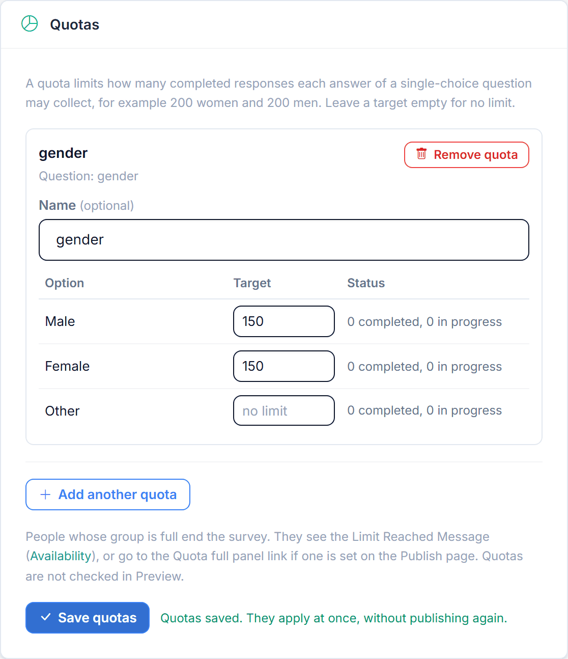
gender: 150 men, 150 women, no limit for "Other".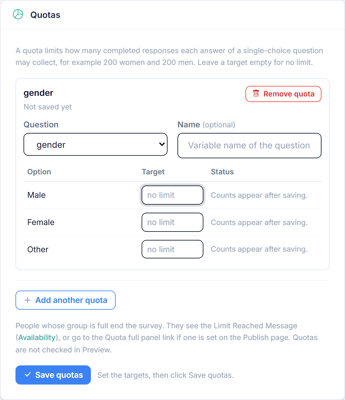
| Control | What it does |
|---|---|
| Add quota / Add another quota | Adds a block. Disabled when the survey has 10 quotas, has no single-choice question, or every single-choice question already has a quota; a note says which. |
| Question | New blocks only. A saved quota cannot change its question: remove it and add a new one. |
| Name (optional) | Up to 80 characters, unique per survey. "Maximum Responses" is reserved. The name appears in the export as quota_full: <name>. |
| Target | Whole number from 0 to 10,000,000, or empty for no limit. An "Other" option of the question gets no target. |
| Status | After saving: "n completed, m in progress"; a Full badge appears once both together reach the target. |
| Remove quota | Removes the block. Nothing is deleted until you click Save quotas. |
| Save quotas | Saves all quotas: "Quotas saved. They apply at once, without publishing again." |
The survey ends with the outcome Quota full. The participant sees the Limit Reached Message from
Settings > Availability (default: "We have already received the required number of responses. Thank you for your interest!"),
or is sent to the Quota full panel link if one is set. The overall limit Maximum Responses
(Settings > Availability > Response Limit) works the same way and is recorded as quota_full: Maximum Responses.
While a quota uses a question, the editor refuses to delete or deactivate it, to change its type, and to delete, reorder or replace its options ("This question is used by the quota ... Remove the quota first."). Correcting option texts and adding options at the end is allowed; if the question has "Other" switched on, adding options is refused too. A quota whose question was removed shows "Question not found" and must be removed before you can save.
When your participants come from a panel provider, you can send them back to the panel at the end. On the Publish
page, the card Panel Redirects has one link per outcome: Complete, Screened out,
Quota full and Quality fail. Write {panel_id} where the panel expects the participant's
ID; Choicery fills in the ID it received in the survey link. A field left empty shows the End Page text (or the Limit Reached
Message) instead. Save with Save Panel Redirects; like quotas, the links apply at once without publishing again.
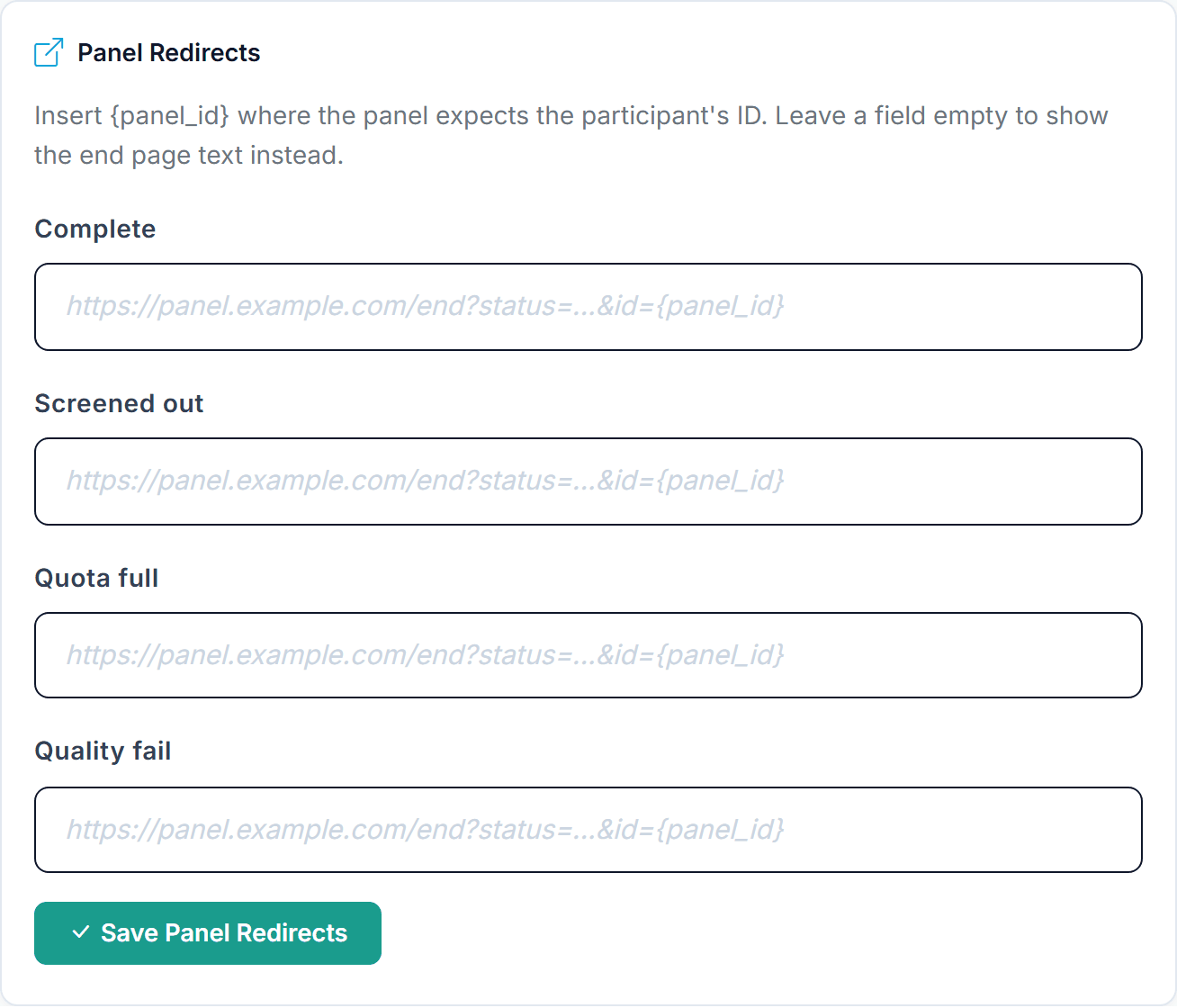
Links must start with https:// or http://, may be up to 2,000 characters long and allow {panel_id} as the only placeholder, after the domain name. When a panel link is set for an End Page's outcome, the End Page editor notes that participants are sent there; in Preview and test mode the End Page shows the link with TEST as the ID instead of redirecting. Someone who reopens the survey after finishing sees the local page, never a second redirect.
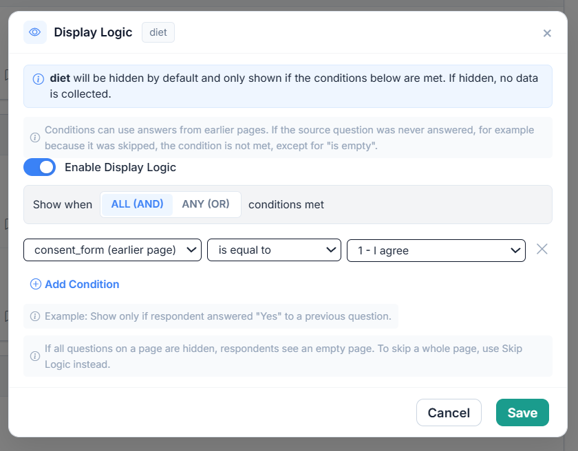
Two related features branch the survey based on earlier answers. Display Logic shows or hides a single item; Skip Logic jumps participants forward over whole pages. Both are configured on the item card itself, through the Add Display Logic and Add Skip Logic links in the card footer (Figure 1, numbers 10 and 11). The Skip & Display Logic entry in the Survey Management panel is a read-only overview of the rules you already have.
Open the item you want to show or hide and click Add Display Logic in its card footer, then switch on Enable Display Logic. The item is then hidden by default and shown only when the conditions match.
Add conditions with + Add Condition, based on answers given earlier in the survey (on an earlier page or above this item on the same page), for example "Show only if children is equal to Yes".
Choose ALL (AND) or ANY (OR) in the "Show when ... conditions met" row, then Save. Up to 10 conditions per rule (the same cap applies to Skip Logic). Delete removes an existing rule.
Skip Logic sits on the question that triggers the jump. Click Add Skip Logic in its card footer, switch on Enable Skip Logic, choose ALL (AND) or ANY (OR) in the "Skip when ... conditions met" row, and give each condition a target. After answering, matching respondents jump ahead to the page containing the target; every page in between is skipped. The target can be any item on a later page, a specific End Page, or End Survey (Skip to end), which always ends as Complete (section 18).
| Source question | Operators |
|---|---|
| Single Choice | is equal to, is not equal to, is empty, is not empty |
| Multiple Choice (one option) | is selected (checkbox), is not selected (checkbox) |
| Numeric, Grid / Likert, Bipolar Scale, Constant Sum | is equal to, is not equal to, is greater than, is less than, is greater than or equal to, is less than or equal to, is empty, is not empty |
| Text Input (Display Logic only) | is equal to, is not equal to, contains, does not contain, is empty, is not empty |
Skip Logic accepts Single Choice, Multiple Choice, Grid / Likert, Numeric, and Bipolar Scale as sources. Display Logic accepts those plus Text Input and Constant Sum. Choice tasks (CBC, MaxDiff, and the rest) can never be a logic source. Choice tasks and End Pages can never be hidden by display logic. A hidden Market Research item skips its whole page (see section 14).
Logic runs live in the browser as participants answer, and again on the server at submission. A tampered or stale browser cannot smuggle data for an item that should have been hidden, and required-field checks for visible items are enforced on the server. Items hidden by logic are skipped in validation and collect no data.
Display Logic can reference any question before the target: on an earlier page or above the target on the same page. Conditions on the same page react while the respondent answers; conditions on earlier pages are checked when the page opens. If the source question was never answered, for example because it was skipped, the condition is not met, except for "is empty". In the editor preview, questions that depend on earlier pages are always shown. Skip Logic works per page: its sources may be anywhere at or before the question that owns the rule, and its target must be on a later page. If a page ends up with every question hidden, respondents still see it empty and continue with Next (the dialog warns "Empty page possible"); to leave out a whole page, use Skip Logic instead. Test every branch in preview before launch.
The Flow Integrity entry in the Survey Management panel opens a dialog that lists everything needing review before publishing: logic rules that no longer resolve (for example a condition whose source question was deleted or moved), invalid randomization blocks, empty pages and timers on empty pages. Empty pages can be removed there with Remove empty page, and Generate Logic Report writes a repair report. Reordering items can invalidate a rule, so open it after any larger restructuring.
diet, food_involvement, or last_order_amount, not the auto-generated IDs. These become your export headers.duration_seconds field makes this easy.Every item type, its internal key, storage pattern, and data type.
| Type Name | Internal Key | Storage Pattern | Data Type |
|---|---|---|---|
| Text & Media | text_page | None (display only) | No data |
| Single Choice | select | {item_id} (plus _o{n}_specify) | Original option number, 1-based (categorical) |
| Multiple Choice | checkboxes | {item_id}_ao1, _ao2... (plus _o{n}_specify) | One column per option (1 = selected, 0 = not) |
| Grid / Likert | likert | {item_id}_i1, _i2... (Radio cells); {item_id}_i{row}_c{col} (Checkbox / Numeric cells) | Scale position per row (ordinal) |
| Bipolar Scale | semantic_differential | {item_id}_i1_p1, _i1_p2... | Scale position per pair (ordinal) |
| Ranking | ranking | {item_id}_i1, _i2... | Rank per item (ordinal) |
| Text Input (single / multi) | text_short / text_long | {item_id} | Free text (string) |
| Numeric Input | numeric | {item_id} | Number (continuous) |
| Constant Sum | constant_sum | {item_id}_1, _2... | Allocation per category |
| Custom HTML | custom_html | The declared variable names | Depends on declared variables |
| Market Research, Kano | market_research | Export: {var}_f{n}_functional / _dysfunctional / _category | Kano codes + category |
| Market Research, Van Westendorp | market_research | Export: {var}_p1_too_cheap ... _p4_too_expensive | Four prices (metric) |
| Market Research, Gabor-Granger | market_research | Export: {var}_start_price, {var}_start_assignment_policy, {var}_max_accepted_price, {var}_price_path_json | Price + full path |
| Evaluation | product_evaluation | {item_id} (Single Choice) or {item_id}_none + _p1, _p2... | Option index (0 = none, 1-N), or one value per option |
| Page Break | page_break | None (structural) | Structural only |
| End Page | end_page | Export column outcome | complete / screened / quality (quota_full set by quotas) |
The {item_id} is generated when you create an item (for example select_1c678aed for the Pizza diet item) and never changes, even when you rename the variable. All response data is keyed by item ID, so your data survives variable renames.
In the CSV or Excel export, headers use the variable name you assigned, not the item ID. Multi-column items (checkboxes, grid, ranking, constant sum, Market Research) expand into one column per sub-part. ID and status columns come first; system metadata such as outcome and the page-time columns sort to the far right.